Hello Type Designers!
From December 2014 until November 2015 (nearly one year), I taught myself Kurrent. It was part of my morning meditation and daily ritual. Once I learned the entire alphabet, uppercase and lowercase, at the rate of one letter per week, I abandoned Kurrent for other hobbies.
Now, I am in my “Basisjahr” which consists of two full semesters (4 half-semesters) of 8-week crash courses. I had Drawing 1, Art History 1, Typography, Editorial and InDesign in the first half and now I have Drawing 2, Art History 2, Type Design, Glyphs App, Brand Design and Illustrator in this half. The current semester began on May 13 and will end on July 5.
The Type Design (4-hour theory) and Glyphs App (4-hour computer lab) are tied to each other and in order to earn my credit points and get my Schein (i.e. pass my class), I must develop my own font and digitize it and print one poster and one booklet (Schriftmuster) using my newly created and digitized font. We don’t have to digitize the entire alphabet, but the minimum to pass the class would be the 12 glyphs in “Hamburgevons”. Our posters and booklets need to be printed by July 3 (the same day that we take our exam for Art History). This means we need to be finished digitizing our font at least by June 25 to send off for printing. That’s in three weeks!
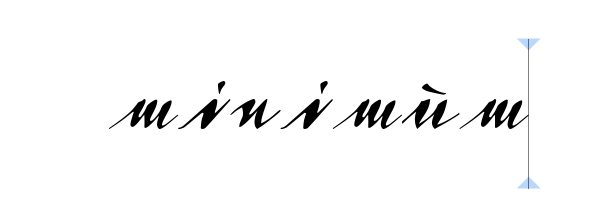
Because I fell in love with Kurrent, of course I want to digitize it! Yes, Professor Veljovich and his assistant Felix Bonge warned the whole class in the beginning that connected fonts are the hardest to digitize, but I am STUBBORN ! Plus, I think the way that I write Kurrent is quite beautiful and Veljovich believes it could be a commercial success. (Maybe this is just a dream, but it’s a very motivating dream!)
So, the tips Prof. Veljovich gave me when practicing, before scanning:
- Always use the same pen and nib.
- Always use the same ink.
- Always write the same size.
- Write complete words so that the spacing is built into it.
I started digitizing this week. I’ve been struggling with the vectors, but like the discipline I had with calligraphy when I was practicing every morning my Kurrent, I do the same with Glyphs. Every morning, I digitize a new letter and I can see I am getting better.
I have plenty of letters to digitize, but at some point I have to start working on the spacing and this is where I could really use some nice tips.
I already read on the forums that entrance/exit points (anchors) are only supported in RTL fonts like Arabic.
In the forums, I found a post from April 2016 where @Mtamaccio writes @mekkablue, “I took all of your suggestions and did delete all the kerning and created the joins primarily with spacing.”
Are these tips listed anywhere?
NOTES: I’m using a trial version of Glyphs 2.6.1 on my home computer (demo ends June 28) and a licensed version at school (probably older, but how much older I will have to check.)