Supposing we have ‘BC’, we can make a ‘kerning pair’, so that C is positioned relative to B. Ok.
Can we go further, and make C kern to B in a specific way when BC is preceded by A, for example?
Let’s say we want BC to kern 20, except when preceded by A, and thus want to create perhaps we could call it a ‘kerning triple’ for ABC, such that BC then kerns at 50? Can we do this?
Thanks, that looks cool. However, it’s from April 2013.
The instructions say:
Enter the kern feature. Glyphs actually creates it automatically for you at export time, using all the kerning pairs you created. Now, you can add some extra kerning on top of the existing kerning by adding a separate lookup to the kern feature.
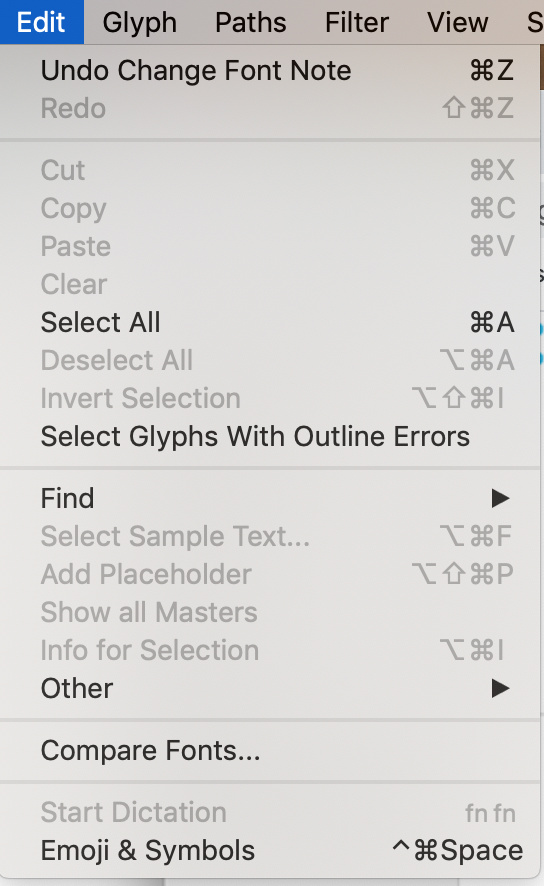
mekkablue, I appreciate your help, thanks. I did paste exactly that myself, above. And the menu which appears by following that instruction, going to ‘Edit’ - I included a screenshot of that menu above for clarity. There is no ‘Font Info’ on that menu.
However, I found another way. Which it also mentioned on that page but intermixed with that instruction to go to the Edit menu, which totally threw me off. So actually within the Features pane which you get to through the window that appears when you click the info button, there’s a + sign on the bottom, Can create a new feature and name it kern.
So, I have it working!
Also it gives this warning:
Since our lookup is feature code that gets injected into every instance at export time, the contextual kerning does not interpolate. But that is not much of a biggie, usually.
I don’t actually understand what that means, but seems I can’t see the changes until exported and used by Pages for example. Looking promising so far! (Is there any way to be able to see the changes from within Glyphs? Would be handy for getting the positioning right!)
Now I am just wondering how to deal with ligatures with this. Say I want:
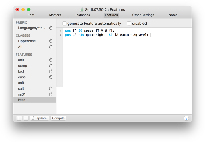
pos A B’ 200 C;
But say AB is (/makes) a ligature. And I want to preserve that ligature. Do I type:
A_B’ 200 C;
In case others read this and wonder what the answer was, I think the answer is A_B.liga’ 200 C; But I am just a beginner, so don’t take my word for it!
Yes. Keep in mind that Opentype Features always work with glyphs, never with characters. So you can Kern between glyphs, no matter how you got to those glyphs in the first place.
You need to work with the Opentype tech not against it. If you make the middle glyphs a non spacing mark and position it with an anchor, you can kern the other two glyphs normally because non spacing marks can be ignored in the kern feature.
And if you have a A_B ligature, you the kerning is not continual any more and you can kern it normally.
Hmm, could do… but that would mean adding a lot more ligatures.
Oh that sounds awesome! Any tips on how I can do that, or a tutorial on it? Sounds like just what I need! ‘a non spacing mark and position it with an anchor’
So I skimmed through the whole article now. It says this:
For mark attachment to work, we need something called combining marks , or, non-spacing marks . Mark attachment does not work with legacy spacing marks.
Typically, combining marks have a comb at the end of their name, and, apart from the scripts that have their own combining marks, usually live in these Unicode ranges:
Does this mean that we can only use those predetermined unicode items? I would like to be able to turn any character I choose, into a non spacing mark and position it with an anchor. Is that possible? For example, the comma? That would keep the input system intuitive. To use actual diacritic input would make it far harder for the user in this context.
Great, thanks!
Until now I have totally ignored the vertical matrices. For example x-height is just whatever it was when I started making glyphs - 500 I assume. Most of the glyphs are taller than that. I have only had to deal with the left and right boundaries so far, and everything is going well in that respect. Not encountered a need to look into the vertical ones until now.
The tutorial says:
So, choose your anchor positions wisely. We strongly recommend the following:
Keep anchors on vertical metric lines wherever possible, e.g., keep bottom on the baseline, top on the x-height or ascender in lowercase letters, and on the cap height in uppercase letters.
Since you have wisely put the _top anchor on the x-height, keep your lowercase marks above the x-height.
So I assume I should now change the x-height in masters, to be in a good position relative to the glyphs, for example in line with the top of the outline of the most standard height? That would be a bit higher than it is now. Is this the correct approach?
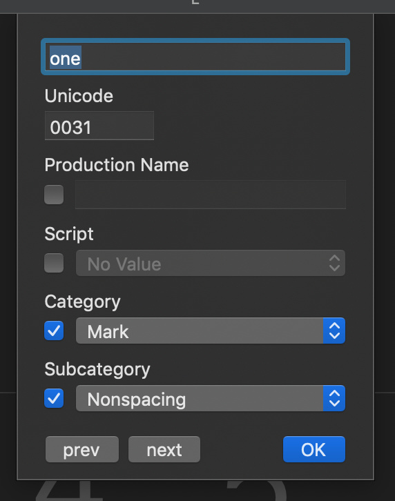
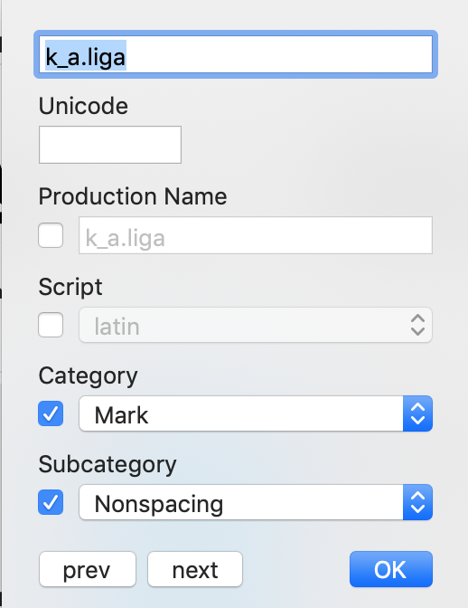
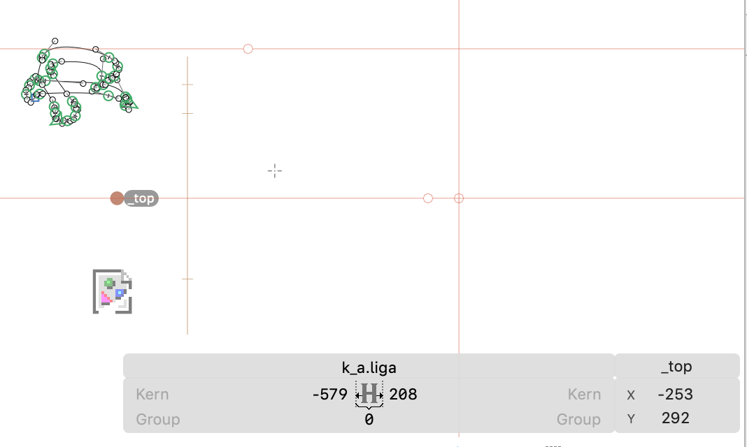
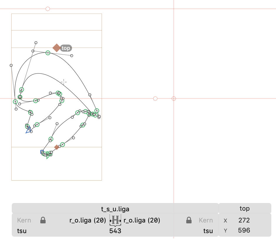
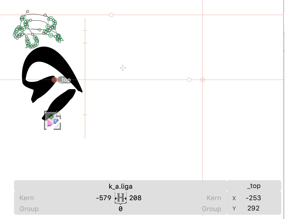
OK so I have tried to make it work. I changed x-height in masters to 596. I changed some glyphs to be nonspacing marks. I established the top marks and _top marks. But moving the marks doesn’t do anything!
Here are some screenshots to show you exactly my situation:
Any ideas what’s wrong? The position merely remains the same as before I made any of the changes, and moving the markers has no effect. However, at least a third glyph lines up with the first glyph now, so the spacing issue did take effect.
Thanks!