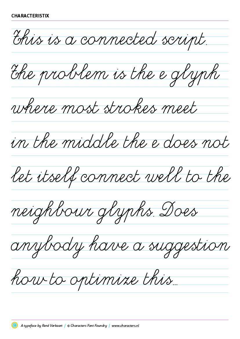
Making an educational connected script font – OpenType help and glyph setup

hi guys,

I’m working on an educational script font, a real connected handwritten font to teach children writing. Where most ‘connected scripts’ are not really fluidly connected, this font is based on a writing method, developed by this client. It simulates a real handwriting and shows children how to write correctly.

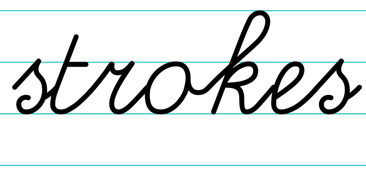
I’ve made a few of these script fonts in the past, but this client wants a font that ‘just works, whatever text you type’. That’s easier said than done… The biggest problem I’m running into is the well known ‘e-issue’. The e is used very often in text, causing issues with the exit- and entry strokes of the neighbour glyphs.

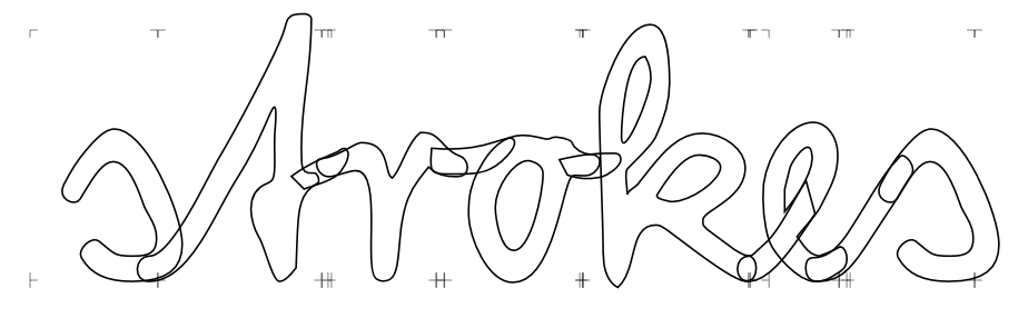
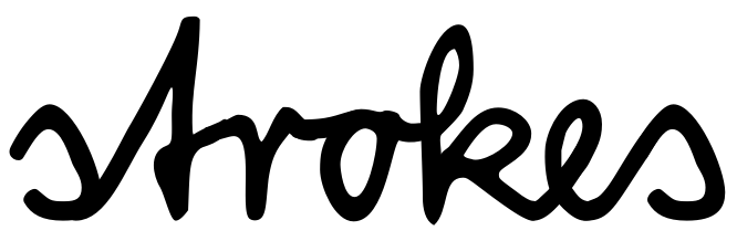
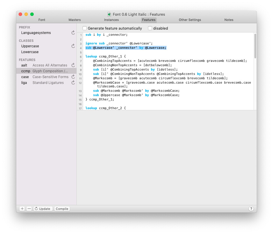
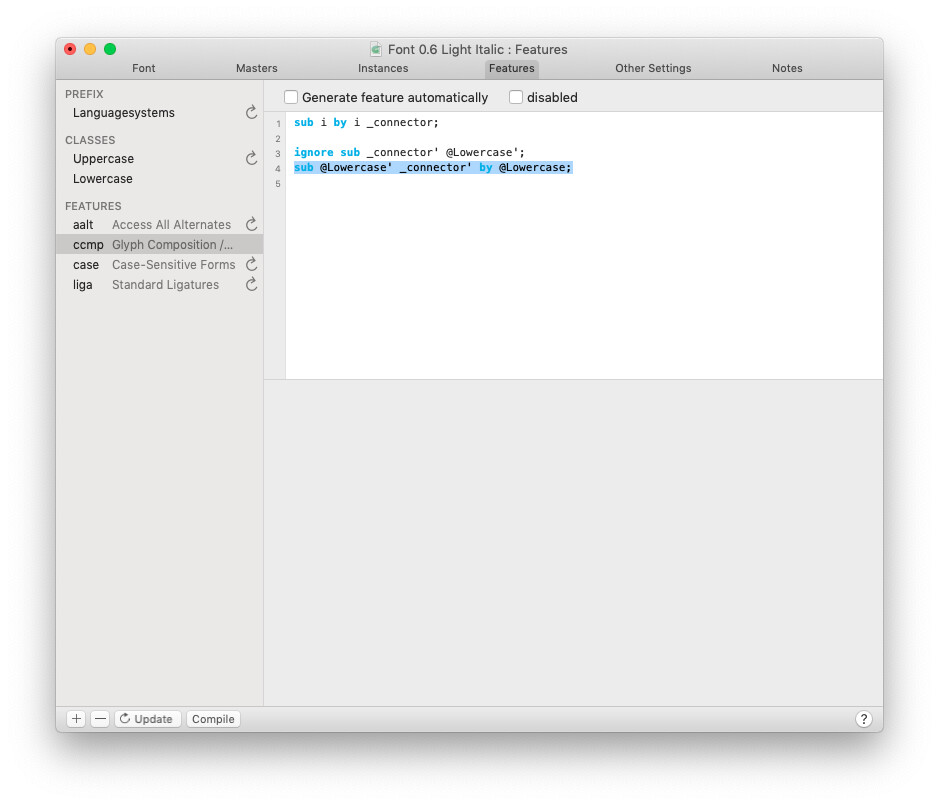
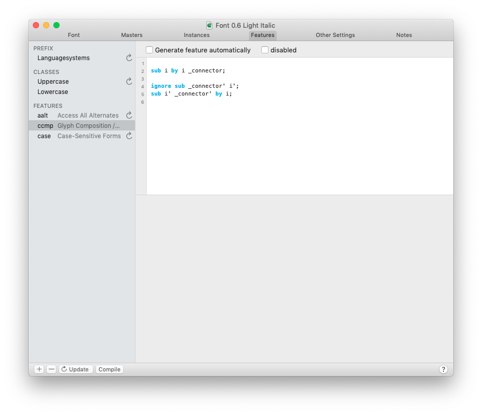
I thought through some OpenType methods, but nothing really seems to be a solid solution. You could change the e after any glyph that causes a disconnect, like this:


It’s clear the middle exit stroke of the neighbour glyph (sample: k) will never match the e entry point. When you change the first e with a stylistic set or salt, you could then change the next e following the first, etc. etc. Building exception on exception… This would require either loads of alternative glyphs, hundreds of ligatures, or over complicated OpenType features.

Does anybody have experience with these kind of scripts or OpenType features? Who can help look for a working solution that prevents me making hundred of alternate glyphs or ligatures for any word in any language.

I would be eternally thankful… :wink:

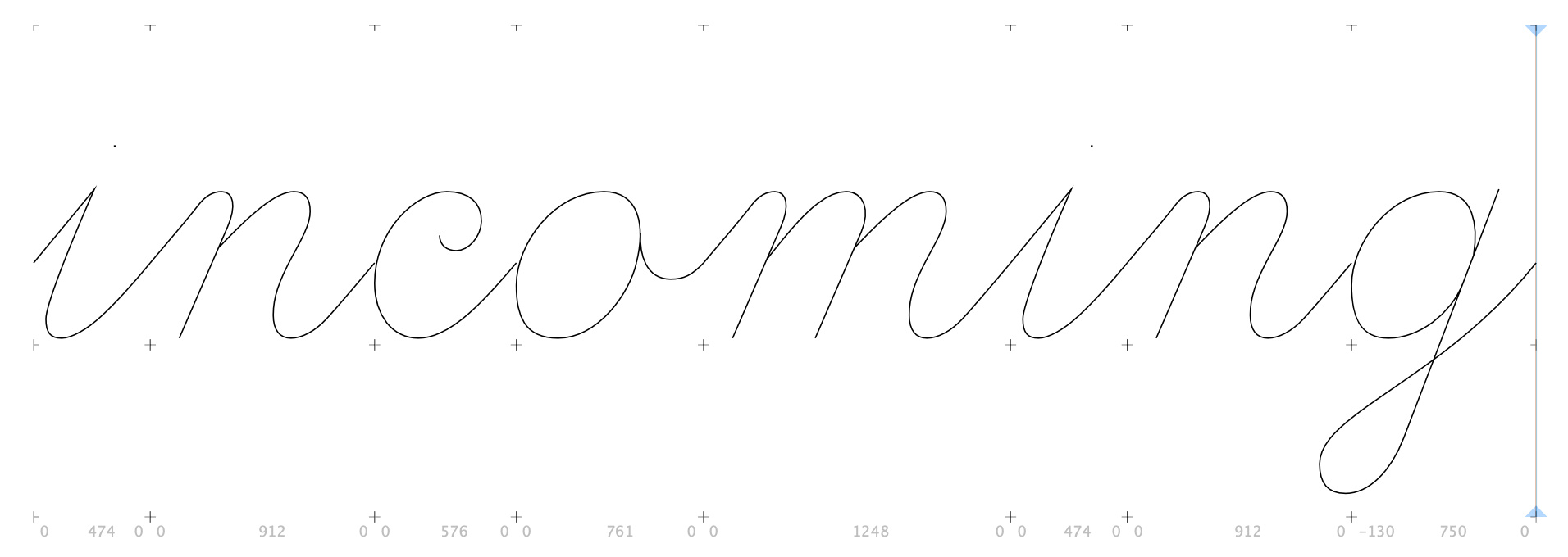
PS: here’s a sample of the current state I’m in. Forgive me, this is a very premature state of the font family. I’m developing a working method, before I endeavour into the details.

I programmed the OT features for a script font with a very similar approach.
What I can say from that experience is do not use ligatures, if you avoid them the font you could support easily any character combination and any language you type. Of course you will need to do a good amount of alternative characters to have a good connection in both sides. For instance in the font that I made the OT features the letter /e has 6 alternatives but it depends on the design.
For me the best thing to do was to create an double entry spreadsheet to “discover” the quantity of alternatives needed.

Increasing the glyph number sound like a lot more work to do but with some scripts you can automate the creation of accented characters, ot classes, etc.

I did a font like this. I removed the in and outstrokes on most glyphs and then added small connecting pieces that matches the preceding and following glyphs. I needed only very few alternate and maybe a dozen connectors. On alternate is an ‘e’ after ‘b’ or ‘o’.

The result was very fluent.

I’ve been working on and off on a secretary hand font (talk about academic!). It’s a cursive script, though it works differently from a modern cursive. I agree with guidoferreyra about avoiding ligatures–that would get you into a horrible tangle. I used contextual alternates instead, and while there are certainly hundreds of them (I have, for example, thirteen forms of the letter m), much of the work was cutting and pasting similar glyph fragments. I was using FontForge at the time–doing it with Glyphs would be much faster and easier.

I’m now reworking a font family with a staggering 12 fonts. In there are, and I counted them quickly, 1.770 glyphs. The e alone has 12 alternative shapes, as does most other glyphs. Activated by stylistic sets. An then there are the ligatures… Since all the glyphs are spread out between 12 fonts, you can never type a real consistent sentence, you need to stack them together by adding glyphs from one of the other fonts. You should see the manual they have. It’s crazy!

So I’m trying to get this all together into one font family. Now I’m at the point that I could need OpenType tips how to set this up.

For me the best thing to do was to create an double entry spreadsheet to “discover” the quantity of alternatives needed.

Do you have an example of this ‘double entry spreadsheet’? I’m not sure if I know what you mean.

So you’re saying, better create heavy OT features and stylistic sets, then making ligatures. This fits to my experience from the other fonts I’ve made. With ligatures you block yourself in the end because you can’t replace glyphs anymore.

I did a font like this. I removed the in and outstrokes on most glyphs and then added small connecting pieces that matches the preceding and following glyphs. I needed only very few alternate and maybe a dozen connectors. On alternate is an ‘e’ after ‘b’ or ‘o’.

@georg, how did you connect the glyphs together? Did you have to type the connecting pieces by hand?

I used contextual alternates instead, and while there are certainly hundreds of them (I have, for example, thirteen forms of the letter m), much of the work was cutting and pasting similar glyph fragments.

@Peter, do you have an example that you could dm me?

Thanks for your input!

My problem (and fear) is just the complexity of the required OpenType features. For instance:

  • In this word Strokes I’d need to change the e after the k.
  • But if the glyph before the k would change I might need to change the k first
  • which would result in the fact that I’d have to change the e glyph again.
    The problem is OT has a specific order and works down every line. If you change it early in the feature, and change it again later, I don’t know if this would mess up the text again. It could make it virtually impossible to catch every word / glyph connection. Does this make sense?

If this is so, how do you build an OT / replacement feature that catches all the possible replacements?

Yeah, my calt lookups got kind of crazy, but I (perversely) really enjoyed writing them. I’ll message you a link to a glyphs file–but some things got broken on the journey over from FontForge, and I haven’t fixed them yet, so I’ll also message a link to the .otf and .fea files.

Briefly, many letters had to join on the left, on the right, or both. Most cases were covered by what I thought of as “standard joins.” For example, the word “minim,” which has only standard joins, looks like this:

As the layout engine steps through a string, it looks forward and backward and substitutes the appropriate joining form for the context (I gave glyphs names like i.jl, i.jr, i.jb, the suffixes meaning “join left,” “join right,” join both"). So the sequence for “minim” ends up being m.initjr, i.jb, n.jb, i.jb, m.jl.

But before I got to the standard joins, I dealt with special cases. For example, an i joins differently with an h to the left than it does with m, n, etc. There were a fair number of these special cases.

Finally, I cleaned up cases that couldn’t easily be handled by calt with a few ligatures (mostly involving long s).

I was surprised, actually, how well it ended up working.

1 Like

I didn’t read all of your previous requests, but perhaps my following tip still applies.

Please be aware that OT-Feature code cannot do magic. Those kind of problems are to be solved with the entire design itself. To break it down to your case with the /k and the /e: try to shape the letters in a way that you can connect them with as few different connections as possible. Letters like k, m, h, i, (this) r, t, u, x … should all have the exact outstoke as the n. e if possible as well. If you have alternate shapes, try to force the outstokes to end in the same position. And if possible also roughly the shape of the part where a preceding outstoke will connect into.

This is how the default glyphs look:


And with some alternates and all the connectors:

Screenshot

3 Likes

Nice. I suppose there’s an OpenType feature you can use to insert the connectors–but what is it?

Yes. You can use several, just pick one that is one by default. I would use ccmp. There you do something like

# first add a _connector after each lowercase
sub a by a _connector;
sub b by b _connector;
sub c by c _connector;
sub d by d _connector;
...
sub v by v _connector;
sub w by w _connector;
sub x by x _connector;
sub y by y _connector;
sub z by z _connector;

# then remove it again when there is no glyph after it
ignore sub _connector' @lowercase';
sub @lowercase' _connector' by @lowercase;

# for those combination I don’t need an connector
sub t' _connector' z by t;
sub r' _connector' e by r;
sub s' _connector' t by s;
sub i' _connector' t by i;
# use alternate glyphs in this case
sub r [e k]' by [e.up k.up];
# then do a lot of context rules
sub W _connector' by _connector.13;
sub _connector' e by _connector.05;
sub E _connector' by _connector.13;
sub D _connector' by _connector.13;
...
6 Likes

Okay. Good. Thanks!

This looks great. Good idea.

I used a few times the method of a middle-connection. All in- and outgoing strokes meet in the middle. They have the same angle as well. This works for most connecting glyphs. Like this:


This works very well, except for some kerning things here and there.

Beside that I had a low and high connecting area. For instance where the /o connects to the /m.

But Georges method is a great idea. I’m just not sure if I could manage the OT. :wink:

Just to inform you why you haven’t heard back in a while. The client likes the steps I’ve done and they’re considering making a complete new font all together. If they do it, they want to do it right. This decision will take some time.

Thanks all for your help until now. I hope I can ask you some more later, but for now I need to wait for the decision of the client.

Hi I’m new to Glyphs.

I’m trying to make a connect handwriting font using your method. I’m testing it on the lowercase i first. I get the error “invalid ligature sub-rule replacement” in the highlighted line. The lowercase class only contains lowercase i.

Thank you!

You cannot mix rules outside lookups with lookup code blocks. Either, all rules are outside a lookup block, or all rules are inside a lookup code block. In your case, wrap the custom sub rules in new lookup code blocks, like this:

lookup ccmp_connector_add {
    sub i by i _connector;
} ccmp_connector_add;

lookup ccmp_connector_remove {
    ignore sub _connector' @Lowercase';
    sub @Lowercase' _connector' by @Lowercase;
} ccmp_connector_remove;
1 Like

Thanks for your support!

I delete all other code and I still get the same error with or without lookup code.
Glyphs 2.6.5

That error message is caused by something else. You can’t do ligature substitutions like this (sub class class by class) specially the by class is not allowed.

You can read about the details here: OpenType Feature File Specification | afdko

Okey, I do this and there is no error and the connector disappear

So what should I code? I want to remove the connector if there are space, period or no glyph after letter i.