I am studying Graphic Design and doing Type Design as my BA. I have only had 3 weeks of Type Design during my bachelor, so i am quite inexperienced. Just to clarify as I think the solution to my problem is quite obvious to most of you.
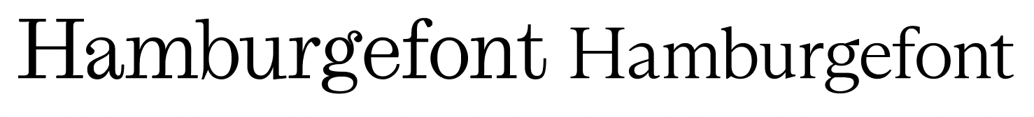
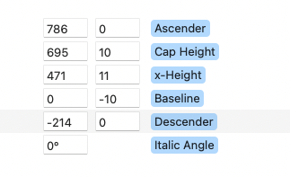
When I export my font it is quite a lot bigger than other fonts in InDesign. Here it is next to Arizona which has similar vertical metrics. The UpE is set to 1000 and the metrics are as follow:
Yours is bigger because the x-height values are significantly bigger. Your Cap Height value is even larger. If you want it to match Arizona height-wise, you have to draw it to those metrics.
From a design standpoint, you don’t have to match other font metrics exactly. You did yours the way you did it, and there isn’t anything wrong with that. Others may (or will) disagree with me on that.
Shouldnt they be the same size considering they are both 1000 UPE? Just with different destributions of the height? Why is my typeface taller overall than Arizona? Is it maybe just because the ascender height of Arizona doesnt go all the way to the ascender height? The descenders seem to match.
The typeface is to be my version of a Scotch Roman similar to Miller’s New Pica Roman No. 2. Therefore it also has similar proportions to a Century. Here it is besides ITC Century and I have matched the x-heights. So if they are both on 1000 UPE and the metrics are quite similar. why do I have to scale down my typeface almost 20% to match Century?
There are no absolute measurements in font. The UPM is kind of the rruler that connects the font units to the real world.
The font is scaled so that whatever the UPM value is is as big as the point size you are setting your text. e.g.: your UPM is 1234. You draw a box in a glyph that has exactly that height in font units (it should stick out of the metrics box quite a bit). Then set some text that shows this glyph in 12pt. Convert to outlines and measure the height of that box: it should be 12pt heigh.
So two fonts with the same UPM but different x-height will look quite different.
Thanks for the help everyone!
I now finally figured out why my typeface looks so big compared to others with similar metrics. In these the ascenders never go to the ascender height, meaning there is a lot of white space in top of the typeface. Is it just a thing to leave a lot of empty space in the top? Maybe for future glyphs that might be higher?
The ascender don’t influence the visual size in Indesign. Please keep the default metrics in the masters settings true to your design. Have a look at this: Vertical Metrics | Glyphs
hmmm… okay to be honest i seem to be missing something essential here. I just dont get it.
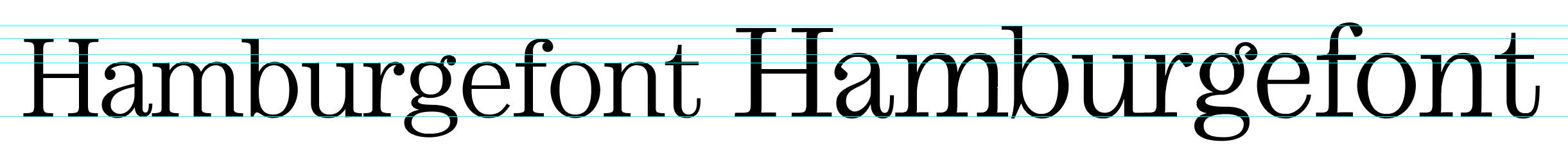
Here is my font (on the right) next to Century (on the left). Their metrics are quite similar. In percentages approximately:
55% x-height
25% ascenders
20% descenders
So, why do they come out in different sizes? Mine just seems to be scaled up 20% compared to Century. If they are both created on 1000 UPM, shouldnt they come out around the same size? You can see that it is not just that the x-height i taller on mine. In fact they are close to the same, but it is the whole font that is just bigger.
Some tutorial or somewhere in the manual that can help me understand this?
Aside from the metrics values, you can see that your letters are just drawn bigger.
If you want the two fonts to be the same size, you have to draw the letters the same size, and not just the metrics values.
But I just drew it as i wanted it on the 1000 UPM. Is it then because Century might not be drawn on 1000 UPM? I just thought that was the standard really. Could I just scale down to 800? Isnt that weird?
I’m pretty sure it is drawn on 1000UPM as well, but how big the letters are has nothing to do with where the metrics values are. Those values do not change your design.
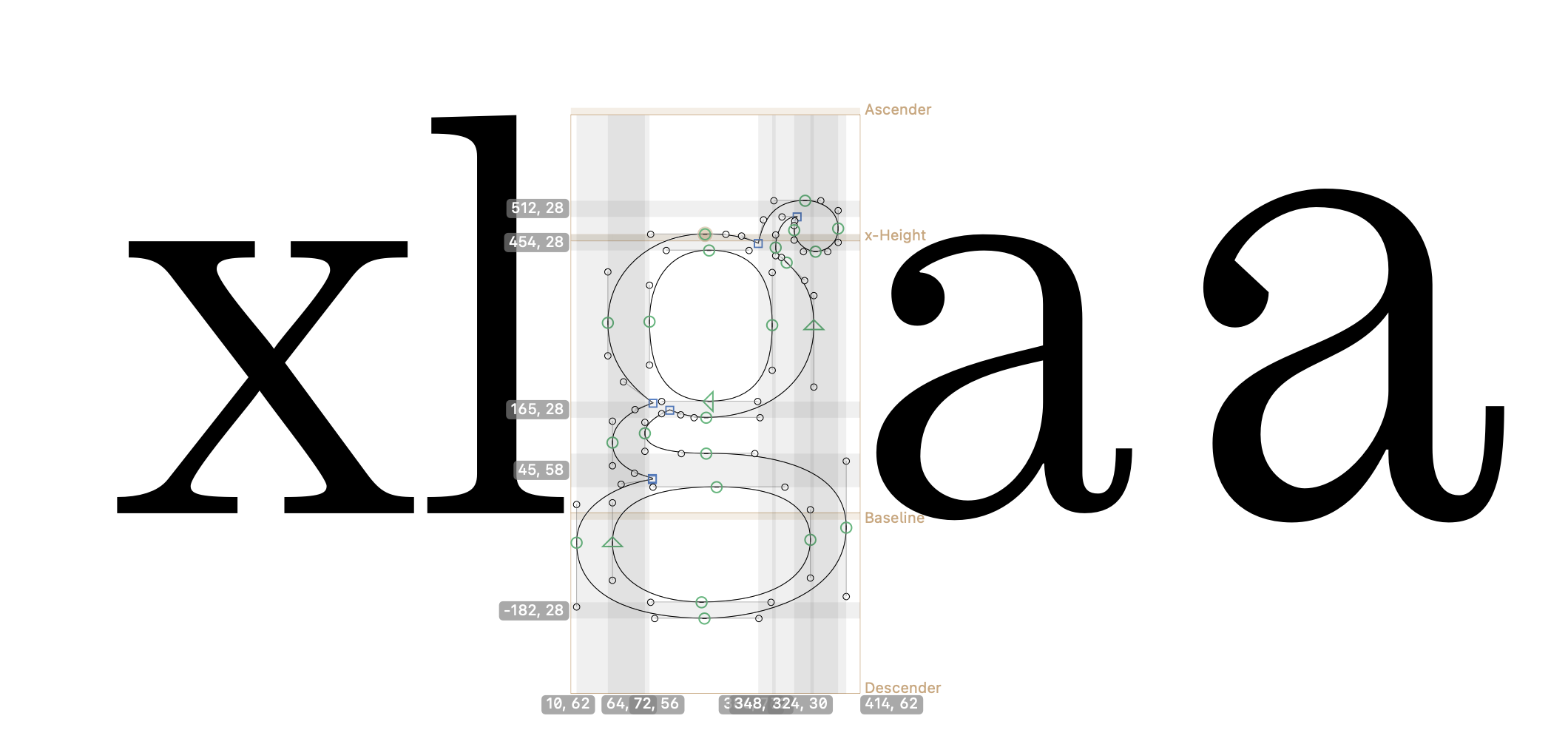
If you open the font file in glyphs you can compare the actual x-height (meaning the highest point in the /x for example, not the x-height value)
You could define x-height at 15, cap and ascender at 30 that won’t change what you draw.
Does that make sense?
Naahh not really haha.
The x-height and the heighest point in x should be same right? If the baseline is at 0 and the x height is at 470 the x would naturally have a height of 470 units.
These units are supposed to add up to the 1000 UPM as I understand it.
If I open up Century and paste my /a it is bigger than century /a as you say. But it just looks as if the missing units to reach the 1000 UPM are placed in the bottom of the descender height as the /g doesnt go all the way down there.
Not sure I understand you fully, but nothing needs to add up to the UPM. The UPM just says how big 1 unit is in relation to the font size (the ‘em’). At 1000 UPM, 1 unit is 1 thousandth of an em.
Arent the distance between the hightest point (most often ascenders) and the lowest points (mostoften descenders) supposed to be be the 1000 UMP. Like A700 D-300
Not really. As Georg said, there are no absolutes in fonts.
You can set your x-height to 470, and yes it is the most convenient to then also draw your x to a height of 470 but you don’t HAVE to.
In fact, you can set whatever you want as metric value in your font, and it won’t change the letters. The x-height value doesn’t necessarily say something about your actual x-height.
Yeah, of course I can always draw the x heigher than the x-height, but as Georg said “Please keep the default metrics in the masters settings true to your design”.
So are most font just drawn with some extra space in top/and or bottom? As with the g in Century that doesnt reach the descender “height”.
Just still dont get why if I follow the metrics I have defined and they proportionally are close to Century why my font is 20% bigger than Century. That must mean Century is not drawn to match the metrics like the aforementioned g. But should I still follow the metrics as Georg says?
My font is bigger than most serifs i compare it too. Are all these just not drawn all the way to the top or bottom?
As I said. The metics values (ascender, descender, x-height …) do not influence anything in Indesign (it is a bit different in web-browsers). That means changing those will not do anything. So draw the letters as you like, set the metrics to fit your design (because the hinting is connected to it). Then change the UPM until the appearance/size in Indesign is right.
And ascender+descender has nothing to do with the UPM. Have a look at Zapfino. The UPM is 400 and the (visual) ascends and descenders are several multiples of that.