Can you tell me how to solve this: the new version of Glyphs is interpolating between my roman and italic masters. It should be Roman Light > Roman Black and Roman Light Italic > Roman Black Italic.
Thanks in advance.
Can you tell me how to solve this: the new version of Glyphs is interpolating between my roman and italic masters. It should be Roman Light > Roman Black and Roman Light Italic > Roman Black Italic.
Thanks in advance.
It checks for compatibility between all masters that you can export it as a variable font. In your case this might now be needed, I have a look.
The problem is the instances are generated between the roman and italics (Light > Bold Italic) . How can I separate roman to roman and italic to italic like in previous version?
In the old versions I could separate the masters with the Custom field setting ‘Italic’. How can I do now the same now?
yea i think theres some missmatch with the masters
i have whide masters effecting reinterpolatoin of regularwidth masters.
Can you send me the .glyphs file?
File sent. I couldn’t figure out how to properly set the coordinates to fix it.
I think I found the way. I was not changing the coordinates in Instances, only in masters.
OK, the coordinates problem is solved. How can I avoid being forced to have regular and italic masters compatible?
I think Glyphs should not assume that all multiple master files will become a variable font. There are good reasons to keep regular and italic masters in the same file (it helps checking and general consistency) and Glyphs should not make mandatory that all (regular and italic) masters are compatible.
There were several steps that lead to that situation. Now I need to find a solution.
Did you change something in the latest pack? Now If I have only a weight axis, the interpolation between regular and italic masters is not mandatory.
I noticed Glyphs files created with old Glyphs versions don’t force interpolation between regular and italics even when opened with new Glyphs builds but I can replicate the same in a newly created file. 
Please notify us when the problem has been solved.
That should be solved now.
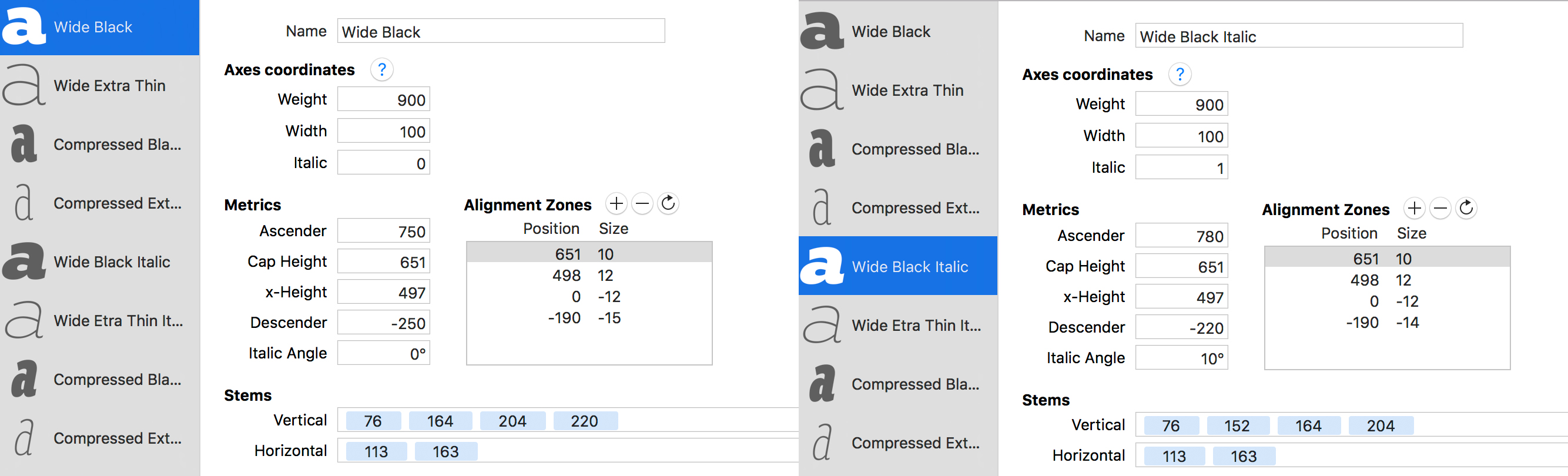
Hello I am new in Glyphs app! I have downloaded the trial version to test it and maybe buy a license after all. So far I love it. But I also have some questions. Let’s say I have 4 compatible masters for 2 axes, width and weight (“font” Compressed Extra thin, “font” Compressed Black, “font” Wide Extra thin, “font” Wide Black) and an other 4 for Italic axis (“font” Compressed Extra thin Italic, “font” Compressed Black Italic, “font” Wide Extra thin Italic, “font” Wide Black Italic) How do I avoid interpolation between Upright and Italic axes. For example when I export my font as aVariable font and test it on axis praxis it looks like this:
My font has intermediate interpolation between upright and Italic. I suppose this will affect my incompatible masters like the small upright a and the italic a That is something I don’t want to happen.
I would prefer the interpolation between upright and Italic to be similar to “FF Meta” which the family seems to have the Italic axes with no intermediate interpolation (the Italic axes dose not interfere with the upright axes and they are like tow separate fonts in the same font file with working axis)!
Is that even possible through Glyphs app? If so please let me know!
Thanks in advance for your time!
Two options:
Yes! Was just saying this re: needing different kerning class keys in the roman and italic. Prreease?
Well about the first option. Is it possible to keep them in separate files and then generate a variable font?
And about the second option,
This is the gradual interpolation on upright to Italic axes (that I do not want my font to have): What happened to Renner*?
This is the instant interpolation on upright to Italic axes (that I want my font to have):
Axis-Praxis: Variable Fonts in the browser
My question was is this instant change from upright to italic possible through glyphs and if yes how do I do it?
The switching is not implemented (yet). I see what I can do.
Thanks a lot for your time! I Have to say I find glyphs a very good and easy tool for designing type as I am getting to work with this app and learn more about how it works. I understand that production of variable fonts as a relatively emerging technology has still some challenges that we as designers have to face and some problems that have to be solved so… please keep us informed and keep up the good work. 
Is ‘ital’ switching still not implemented?