I’m looking for pro/con feedback on two different ways to implement glyph composition with OpenType, where the character is composed of 3 to 4 glyphs. I probably don’t have all of the terminology right as I just started diving into this.
Use the LIGA feature (chained if > 2 glyphs) and point the LIGAs to unicode code points in the PUA that has properly composed character
Use the CCMP feature (chained if > 2 glyphs) and point the CCMP to a non-unicode layer that properly constructs the character
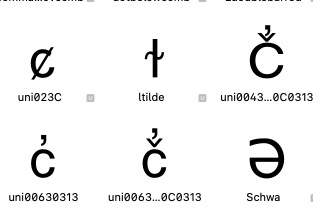
Here is glyph info for a single character
Usage 1 (LIGA):
Layer name: Regular
Parent name: ccareje
Parent unicode: F729
Parent category: Private Use
Parent subcategory: Other
Parent string:
Parent id: 4686DD0B-AC25-42B0-A81E-1B7B97C8051D
Parent store category: False
Parent script: None
Parent plyphinfo: <GSGlyphInfo ‘ccareje’>
With the fonts I created in 2013, I constructed them using ‘Usage 2’ with CCMP features (originally with FontLab and then with Glyphs per your advice 2013). However, there is pressure from some of the users of the fonts I developed to begin using another source for fonts and software keyboards that have implemented the ‘Usage 1’ version with LIGAs.
Since I haven’t worked with this process for nearly 10 years, I’m hoping you can refresh my original thoughts so I can explain to the users the pros and cons of my approach (CCMP) vs the other solution (LIGA). One other difference is that with my fonts I used CCMP to inject a uni 034f code point between the prior combining glyphs and a wsuperior so the entire glyph set can be considered a single ‘character’ for the purposes of spell checking and data entry. With the other solution (LIGA) the wsuperior is just another character that can be visually attributed to the prior glyphs, but at a programmatic level is not specifically associated with the prior glyphs. Hope that makes sense.
Do you have any other thoughts regarding this? Also, I’ll look at mark and mkmk as I’m not familiar with those usages. It’s been a long time.
The difference between ccmp and liga is that the one should be always on and liga can be deactivated by the user. What you can do with both features is otherwise the same.
If the user uses a system that is capable of OpenType, you should not add PUA codes to your composed glyphs.
And as Rainer already said: Why not use the mark feature/anchors to build the glyphs on the fly. Can you post a screenshot of the c_caroncomb_commaabovecomb glyph?
I’ve attached examples of characters that are used for local Salish or Kootenai languages.
To rephrase the issue, it is either using someone else’s font (that uses LIGA + PUA, something I can’t change) versus what I believe is a better long term solution of CCMP, mark, mkmk or any other feature set that doesn’t rely upon PUA. I was brought back after 12 years to justify why my solution is more appropriate than the other (LIGA + PUA). I’m only one person who doesn’t know very much. What I need is feedback from experts that, if it’s accurate, say ‘don’t use PUA’. If you guys say it’s okay to use PUA, then I probably won’t jump back into this. If you say ‘don’t use PUA’, then I will continue to pursue the other features mentioned earlier and continue to support the solution I developed. Hope that makes sense. From my perspective, it’s sort of a political issue trying to explain to non-tech people (who just use the language) what is a more appropriate solution for long-term language sustainability. I was told many years ago to never use PUA (both by FontLab folks and Glyphs folks), because if the font is no longer available you’re out of luck, which is why I pursued other alternatives. Thanks for any expert feedback you can provide.
How would that nonsense manifest? Copy and paste? Screenreader? In my testing the original character is copied, even if a Unicode char is replaced by GSUB by a glyph with PUA coding.
I don’t see the point of having liga + PUA. Do either. For some scripts/languages it was the only way to get support for in apps before they had proper OpenType support to basically create a private encoding in the PUA. If people do have texts that contain those private codes, you can try to convince them to convert them to proper unicode but you most likely will be forced to stick to it. But if the texts are encoded with proper unicodes, then just forget about the PUA as fast as possible.
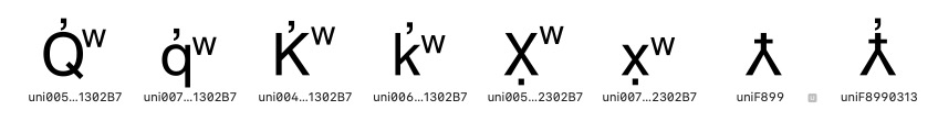
And I don’t see a point in adding a precomposed glyph that contains the MODIFIER LETTER SMALL W. Just typing it next to the other glyphs will work fine (at least for either the lower or uppercase; but that should be handled by a contextual form instead).
So the question is what are the texts look like. Do they contain the PUA codes or not.
It appears to me that the documents created with the LIGA+PUA solution have the individual unicode code points for each glyph (when I extract either the unicode or look at it with a hex editor), not the PUA code point. Here is the LIGA feature reference for a specific character: sub C cdmcar cdmeje by Ccareje;
where ccaraje is at code point F729.
Also, I believe I understand what you’re explaining regarding the wsuperior. However, when I was working with a crossword puzzle developer to create a workable solution it didn’t work as the wsuperior was seen as just another character, so it would be put into another crossword puzzle box. By adding the 034F the sequence of unicode glyphs included the wsuperior, with the prior glyphs, into a single character that was placed into a single square in the puzzle. Hope that makes sense. However, there may be another solution to this. If this were a recognized language to the OS I’m assuming this wouldn’t be an issue. But, I don’t think that will happen any time soon.
If the texts are correctly encoded, the get rid of the PUA codes are fast as possible. And with it most of the precomposed glyphs.
Do you know what software is used by your users?
The users use Mellel, Word, Pages, InDesign and several other applications. They mostly work on audio to text transcriptions. They also do language documents, books, publications and flyers. The State has also used my fonts for producing native language road signs (I think using AutoCad.) In the future, they’ll be doing more work with spreadsheets and databases.
If I’m correctly understanding your advice, they should avoid using the fonts (from another source) that use LIGA+PUA and continue using the fonts I’ve created that use non-PUA OpenType features?
And, thanks for your feedback and advice. If they hear it from multiple, expert sources than it will be more readily received. I’ll investigate the prior recommendations to improve the font operation. Jim.
The point is that if you don’t use PUA codes you could use any font that has all the the needed glyphs. It it would be rather easy to adapt other fonts. I just had a quick look at the alphabet charts of the two languages you mentioned and it seems that fonts that support IPA should be able to write them.
Can you send some text sample that show more challenging combinations as plain text and as pdf or screenshot that show how it is supposed to look? With that info we can add the languages to the languages sidebar in the font view.
I totally agree, which is why I went down the path I did 15 years ago. I think that path was validated in that they can use Mac/Windows OS to type Salish file names at the OS level using default system unicode fonts (for most, but not all characters.) I can’t provide any of the cultural docs that use the fonts as they are considered proprietary and haven’t been given to me. Here are some URLs that have local Salish words. The caveat is that there are a half dozen different entities that frequently use different fonts, with different encodings, for their work. Their are dozens of different Salish bands with their own unique language differences.
Salish online dictionary: http://salishlanguagedictionary.com/dictionary
Salish language course: http://www.salishaudio.org/Book%201.pdf
The “Dupuis” font is one (of many) I developed many years ago. It includes just characters for the local Salish and Kootenai languages. The Culture Committee has used this for many years for document production. Most documents typed with this font appear to work with other compliant Unicode/Opentype fonts. Dupuis.ttf (49.9 KB)
‘Official’ CSKT fonts: History and Culture (csktribes.org)
“Aboriginal Sans Regular” is a font developed by an alternate group. It includes characters for many different native languages in Canada/US. Some people appear to be getting pressure to begin using these fonts for their documents and language work. Aboriginal Sans REGULAR 938.ttf (771.9 KB)
I can provide software keyboards if that is helpful.
Since I haven’t worked with font development for over 10 years I’m trying to determine if the use of the fonts I developed (and/or any other properly formed Unicode/Opentype fonts) are still the way to go. Or, if it is a non-issue and they can convert to using the two typefaces/fonts by the alternate group (Aboriginal Sans and Serif.) The original project goals, 15 years ago, were
Document preservation (hundreds of years in future)
PDF production (embedded fonts) for document exchange
Identification of 3 glyph characters, such as k̓͏ʷ, as a unique and specific character (rather than a ‘glottalized’ k followed by a w superior, if that makes sense)
Adherence to Unicode and OpenType standards to support future use of any compliant typeface/font
I had a quick look at the fonts. The ones on the csktribes.org site have very different quality. The kootenai.ttf is broken to the extend to be unusable. The others seem to be fine. They use one code point in the PUA for a letter that looks like an uppercase lambdastroke.
The Aboriginal Sans included much more languages and seems to be mostly valid unicode/Opentype.
So to answer your question. You most certainly don’t need PUA codes for precomposed glyphs (only the one that seems to have no proper unicode).
But I would remove most of the precomposed glyphs and replace them with mark positioning, kerning and maybe a few alternate glyphs that are switched in contextually (e.g. a slightly raised periodcentered next to the A.
I wasn’t paying attention to the csktribes.org web page. The fonts I created are Dupuis, Pablo and Slater. It appears several other fonts (Salish and Kootenai) are from someone else and I’ve never looked at them or used them. I don’t know their purpose or source, but will inquire.
I’ll work on implementing your suggestions for mark positioning
At the time the fonts were created, I don’t believe the code point with the PUA (upper lambdastroke, but slightly different for this tribe) was available. I’ll review this again.
What is your opinion of the Aboriginal Sans fonts and their use of LIGA and PUA? Is it a big deal or inconsequential?
Using PUA for glyphs that can be accessed by OpenType features is plain wrong. There are a whole lot glyphs that are not encoded in unicode. Until they are added to unicode it is the only save way to use them. But it should be done in a more efficient way: e.g. there are czmo czmoo czma czmaa. The ones with double vowel are the same as the previous but with a dot above. the double vowels shouldn’t have their own code but should be czmo + dotabovecomb.