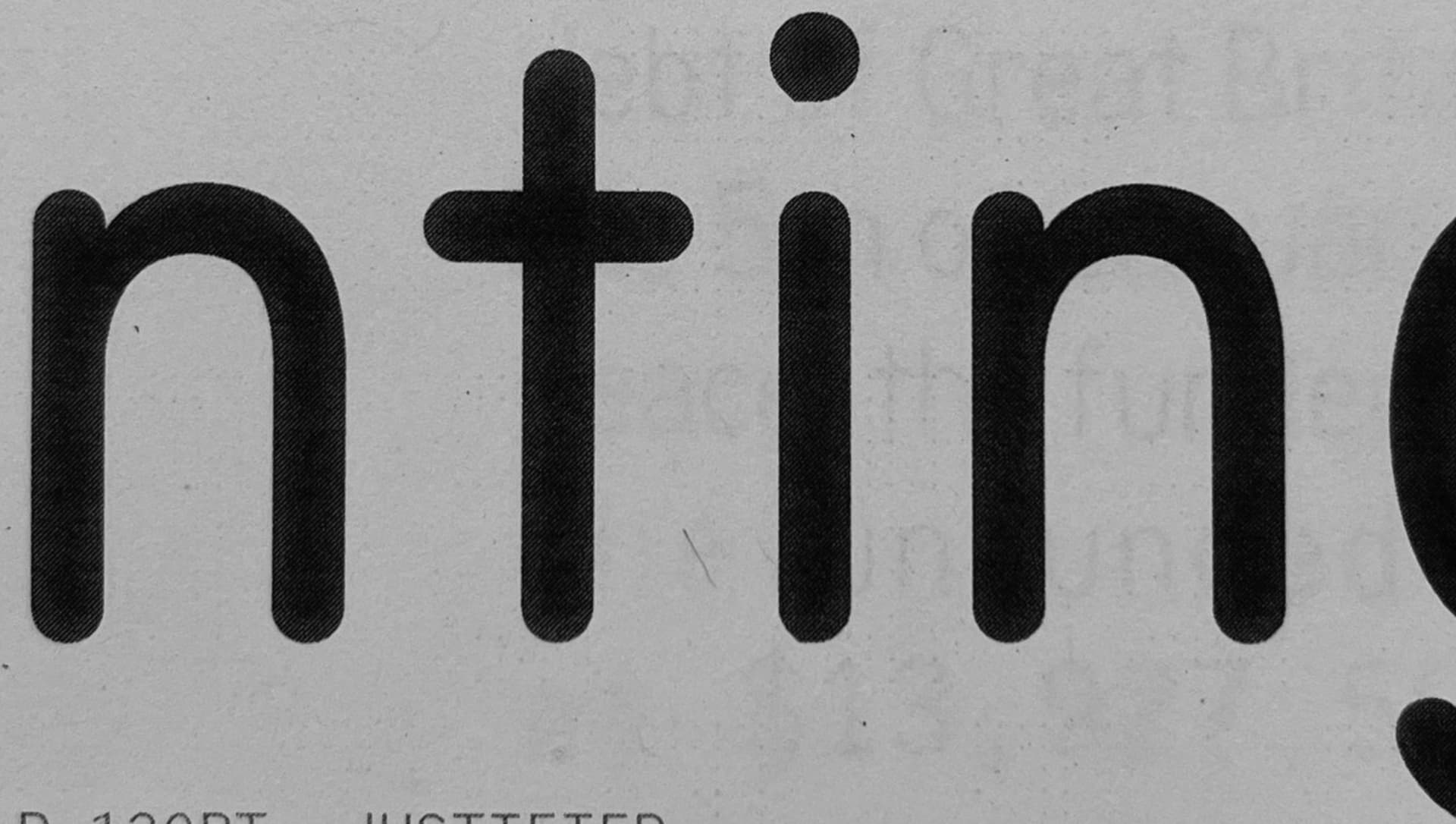
I have a fairly straightforward drawing: in digital proofs and on screen in general all seems fine, but when printing I spotted a kink in the i dot. I worry that this might appear in more places so, I was wondering if anybody has any thoughts, or whether this is a Glyphs issue at all? This was printed directly from InDesign 2022 with a xerox Phaser 7500, using interpolated OTFs exported from Glyphs 3.
edit: the nature of the issue seems to be that it’s filling the space between quadratic curve handles? not sure, but the point being where it is kinda looks like that…
Images attached:
the issue in print
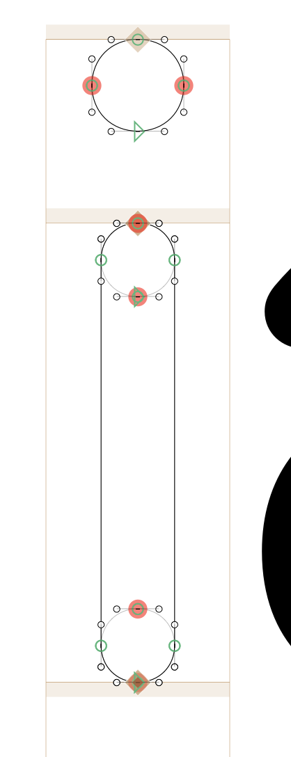
the outline for the character in question
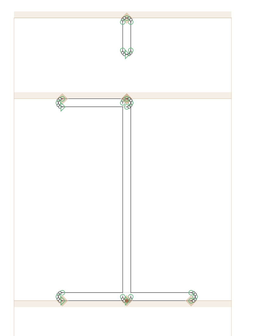
context for why the outline is the way it is (compatibility with weight and tabular width axes)
That happens sometimes with TrueType outlines with some start point setups.
something else: You should clean up your outlines. The red nodes mean that there are two nodes very close or on top of each other. And there seem to be circles on top of the rounded stems. Those can be removed.
The third image in the post describes why the outlines are drawn the way they are, I would myself agree that this is probably the best solution, at least I can’t think of a better way to ensure outline compatibility.
One thing that can probably be optimised is the bottom of the stem: you don’t need the stem of the i to be rounded at the bottom – you can cut it off horizontally in the middle, it will be covered by the circles of the base stroke.
Otherwise, using cap components for the round endings might help (although I don’t see how that changes the exports – the resulting paths will be exactly the same).
Bad idea to replicate the same edge twice with different paths, even if it is just one segment. Bound to have artefacts from overlap removal. Can be done better for the i.
I agree, and, in fairness, these were initially drawn as quick fixes to guarantee master compatibility. I need to go back into these and improve for sure. However, I don’t think this is responsible for the issue, especially with regards to the dot on the i. That’s a single object and I’m not convinced there’s a better way to interpolate between the rounded rectangle dot in the light master and the circle in the heavy.
So what do we think the issue is with the outline in print in this case?
Hi @kiatas ! It might be fine! Make sure you test in a different printer. I experienced very similar ‘print kinks’ with that exactly same printer Phaser 7500.