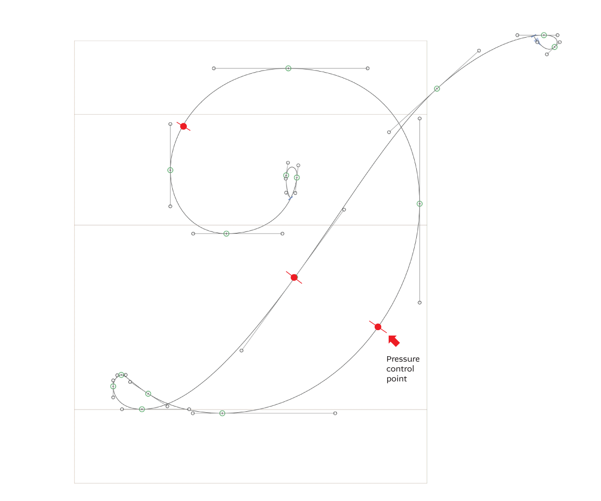
I have a feature suggestion. It would be great if there was an option to simulate the pointed nib calligraphic pen in combination with the offset path filter. Something like this: first you draw the contour as you would for a monoline font, then you set the pressure control points on the contour to get the thickness where you like. Each pressure point could have its own value. Here’s a sketch:
@mekkablue – Are you sure about that? I tested the plugin months ago and it’s not what @knikola is asking for. What he is asking for is much more precise in that one would enter a value for each node throughout the outline where pressure was desired. I see a huge value in being able to do that when producing fine formal scripts.
Do the skeleton
Apply the thinnest outline (Offset Curve) you need
@George_Thomas is completely right. I’ve just tested the Letterink app. Although it seems to be very useful as a broad nib simulator, it lacks the vital aspect for the pointed nib. There’s no way to set the nib to be a perfect circle, to get the monoline stroke. Also, no way to set the control point anywhere along the skeleton independent from the base nodes, which makes the skeleton too complex for an elegant workflow. I would have to add nodes in the middle of the curve, in addition to those on the extremes, which would make any changes to the design a nightmare. In this case it is much quicker working with the Offset Curve filter.
Three steps described by @George_Thomas is what we need!
@knikola – I changed it because after a second look at your image I thought I left something out. It can be done either way.
ETA: Now that I think of it, if one just didn’t enter a pressure value prior to Offset Curve it would not affect it so long as it could be done after-the-fact.
I think your 4 steps are explaining the requested feature in a correct way. Apart from not being able to simulate a round nib, the main problem with the Letterink app is being forced to define the skeleton in so many nodes. Usually, the right way to define a curve is to use the nodes on extremes. But in Letterink’s setup, you’re forced to add nodes in between, which makes the design hard to work with.
Also, @mekkablue is right. Perpendicular control nodes is what is needed.
Select nodes which are to be pressure-point nodes and mark them as such.
In Offset Curve, enter the value for the thinnest outline in the design, and a value for the pressure-point nodes.
Apply (Offset), which would expand the skeleton for both the thinnest parts as well as the pressure-points. This might allow Glyphs to calculate the curves better requiring less adjustment afterwards.
That is true; the pressure-point nodes would have to be added. In my mind that’s the easiest way to define them because nodes are already a fixture of the skeleton or outline environment. A software engineer might have a better way.
I’m thinking about something like this for some time.
For now, simply omit the extreme points that you don’t need. I do that for italics all the time. And if you still think they should be in the final file, there is an export filter for that.
But technically there is not really a problem with adding the node there. Especially in script typefaces, extreme points do not necessarily make sense, so put the nodes where you need them rather than at extremes. That is also what Georg meant.
Not quite. From the images you posted, the resulting movement is confined by the surrounding (path defining) path points.
No BCP correction? Onto both sides (left and right side of the path) equally? Exactly perpendicular to the tangent?
Of course. It would be an exception to not do so in most cases.
Not necessarily.
Exactly? I can’t guarantee that.
Why the detailed questions about a simple answer I gave to a previous question? It appears to me it’s getting off-topic; we were just discussing a desired feature.
Oh, OK now I get what Georg wanted to say. I’m sorry but I have to disagree. I’ve spent years perfecting the technique of defining curves with nodes on the extremes. Of course I can draw a decent curve with nodes elsewhere, but any changes to such shapes are difficult to control, and I would end up wasting too much time. Especially when making a fine script – there are constant tiny changes to get the perfect shape. Nodes that are not on the extremes usually tend to make the shape bumpy.
Glyphs is perfect for my workflow as it is. The feature I’m asking for would just speed things up, without me having to change my technique.