Yes, of course you are right @mekkablue. But that is the point of the requested feature. Make the skeleton with nodes on the extreme and then additional (defining) nodes are added to the outline with the Offset Curve + new feature.
Look at it like this: the skeleton only describes the movement of the pen. Pressure points describe where the pen tip was widened at its maximum, perpendicular to the skeleton. Imagine how quickly I could move through the design if I was to draw all letters as a skeleton, then go through each one and apply the pressure points which affect the Offset Path filter. Then I set the Offset Path (just for the thinnest stroke) as a Custom Parameter and Export! In the end I would not care where the filter puts the final nodes on the outline at export time.
Hi there,
This is very close to how I create my designs through Illustrator using the width tool. It would be very time saving if this could be done in Glyphs directly - actually I probably wouldn’t need illustrator at all if this would work in Glyphs. And insanely productivity increasing if it could be modified through parameters. Oppose to @knikola I would suggest to not do it through a filter but magically attach the left and right extremes of the width points (which should be addressed individually for asymmetric extension - just like in Illustrator) to either some variable fonts menu or master axis. Filters I find mostly unpredictable and very precise to work with.
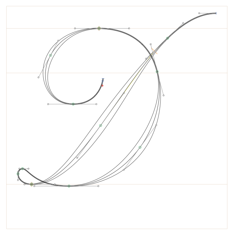
Here you can see my process, which seems similar to @knikola
Here is a video:
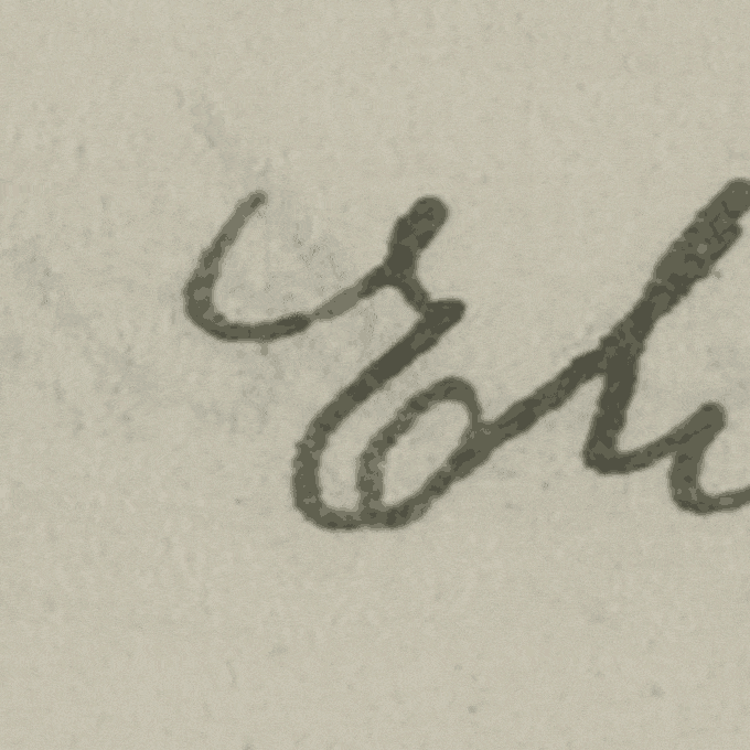
In my workflow the pressure (or width or expansion) points have to be separated from the path. I think of it this way: The path describes the movement of a pen, whereas the width coordinates are added like a map of expansion to the path or a 3rd dimension (pressure, width). The width tool in illustrator does exactly that:
Maybe that is an inspiration. I think such an addition to glyphs would be fantastic.
Have a great day.
I think it is pretty similar or aiming in the same direction.
I would suggest gradually along an axis where the user defines the extremes for each side left and right (A and B) for each state for thin (0) and thick (1) resulting in (A0,B0) for the thin state and (A1,B1) for the thick state. A factor z for the versions in-between between 0 and 1 (Az,Bz).
Maybe the BCPs (ab) of the “width” points could be parameterized too (A(xy)z | Aa(xy)z | Ab(xy)z and B(xy)z | Ba(xy)z | Bb(xy)z)
I hope this information was helpful.
Did this answer your question?
OK so it seems that the Width Tool from Illustrator is the exact feature we all are asking for. I’ve never used it before because I’ve only used FL or Glyphs for font production, but after watching this video it became obvious that this tool is exactly what we need: https://helpx.adobe.com/illustrator/atv/cs5-tutorials/using-variablewidth-strokes.html
@knikola – That video is exactly what I was visualizing. I didn’t know that feature was in AI but it is good to know. However, it would still be a huge plus to not have to work in AI then bring it all into G2.
The only thing missing in the video was converting the path to final outlines which would be a necessity.
In my experience, the width tool in Illustrator is not very good for drawing type. I would hope that if such a tool is condered for Glyphs, it would not try to mimic Illustrators behavior.
For one thing It has trouble transitioning from a thick stroke to a thin stroke while going around a sharp turn (down stroke to up stroke). It has a tendency to make strokes that you want to be a consistant width concave.
Expanding the appearance gives you thousands of points that woud be a nightmare to clean up.
By the time you’ve fiddled with the width points to try to get something acceptable, you may as well have just drawn the thing.
There more going on in scripts in the way thicks transition to thins than you may realize (more than just math). It takes a human eye to get it right.
I agree that drawing a skeleton and definng widths woud be an awesome way to work in Glyphs but the tools will have to be a lot smarter.
While its not a variable width tool, Something like FontLab’s Power Brush Power Brush - FontLab VI Help would be nice.
Who, me? I don’t see how. OK, I obviously was not painting the perfect picture, but both @George_Thomas and myself were visualizing the same thing. I was practically imagining something like the Width Tool in the Glyphs environment, with the ability to use custom parameters. Everything is there: perpendicular pressure points not affecting the skeleton.
I asked you what you do in that case. You said you introduce points and drag them apart, not compensating the BCPs. This thickens what used to be one segment and is now two segments.
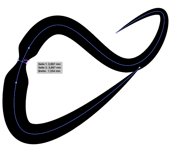
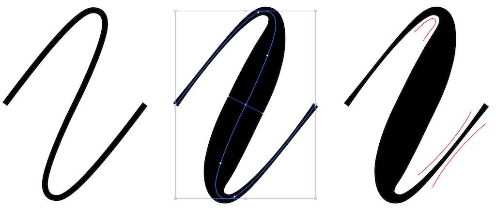
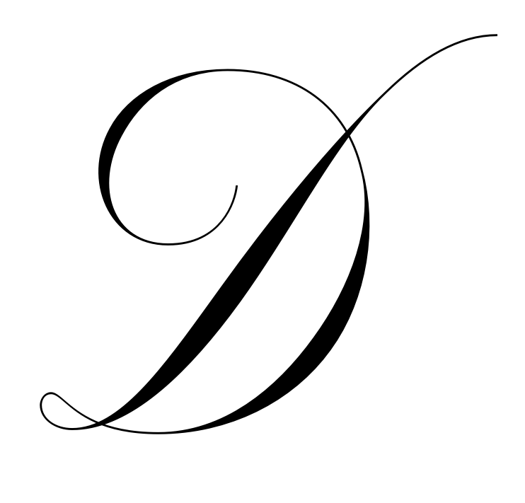
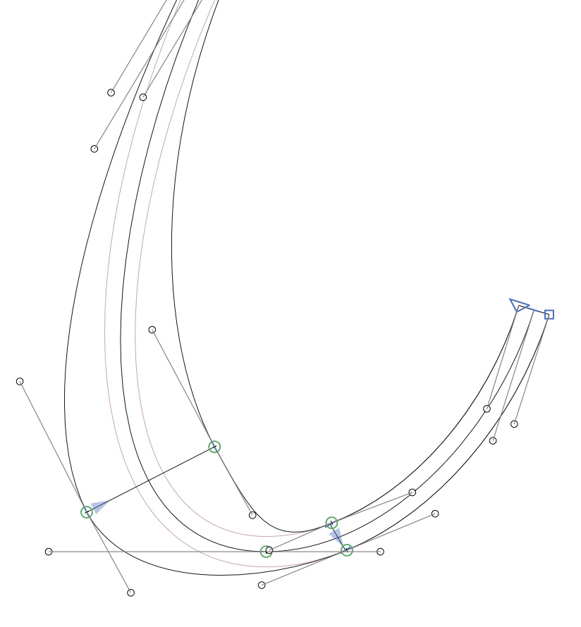
AI’s algorithm is different: it affects adjacent segments, the user has less control, and it is, well, pretty imprecise. And how they calculate the swelling, is not clear. Harald suggested it is a linear thickening, but it is way more complex than that. AI actually inserts many more points. To illustrate:
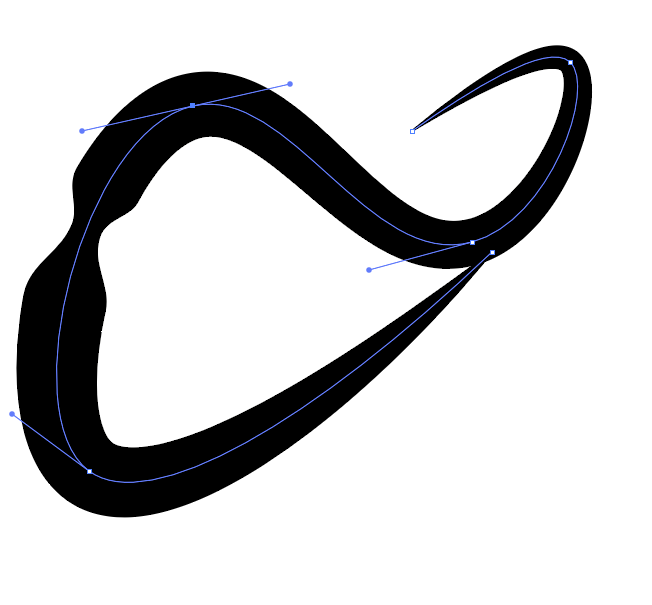
This is the Width tool applied once on a stroke. I do not think that this is what you had in mind.
In order to achieve a similar result to your own workflow, you would have to introduce many width points and manage many widths at different points. And I doubt this makes things easier.
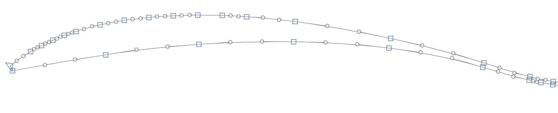
OK, you lost me there. I’m sorry but my technical knowledge in regard of algorithms calculating the swelling is zero. That is probably why we have trouble understanding each-other. Of course I don’t want the result in your example above. My point is, I would like a workflow in which I could draw the skeleton and use a filter (or feature) to get the preview of the shape. Then adjust the skeleton and the filter to the point were I could expand the shape to get the outline and do the fine-tuning for the end result. Yes, getting this many points on a path after expanding would be disappointing.
Idea:
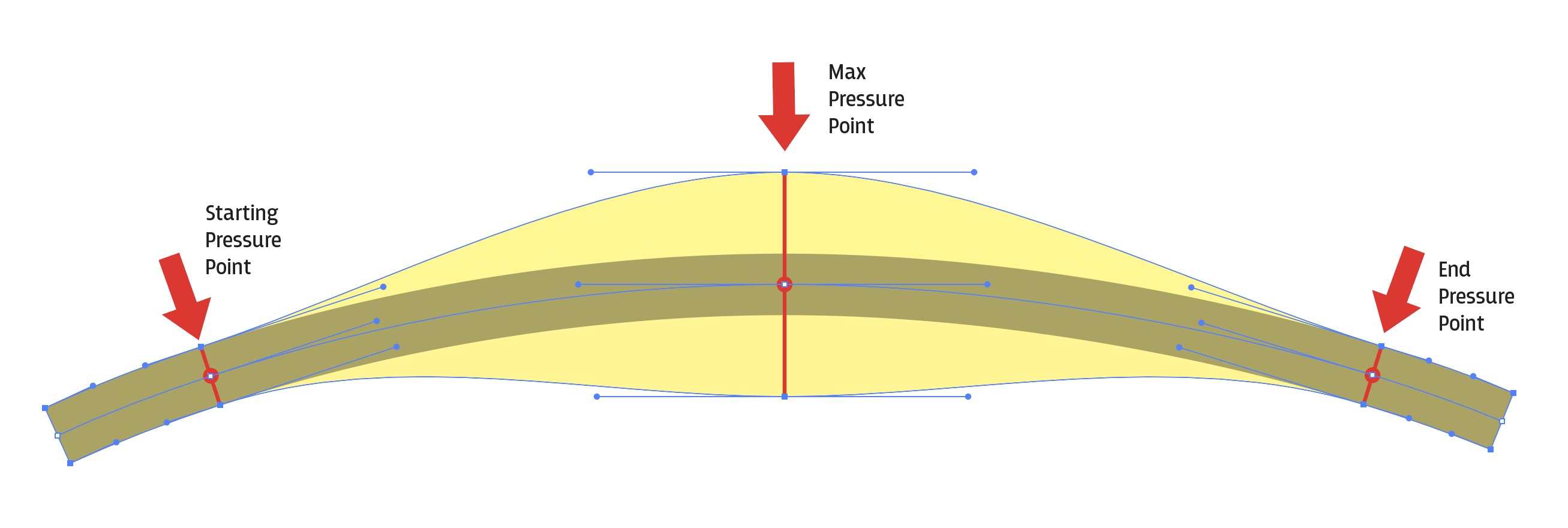
Maybe introduce a triple pressure point on the skeleton? First one where you want the pressure to start, second one at its maximum, and the third at the end of the pressure. After that the shape returns to monoline.
Transforming a path like this is really difficult. Offsetting a path (even simply with the same width) produces a shape that is not possible to describe with the same number of segments. One can fine a approximation but only to a certain extend.
And as Rainer tried to explain, it needs more user input than just the width at certain points to property control the width progression.
I’m obviously out of my depth here, so I sincerely apologize if my questions sound silly.
This is what I meant with the triple pressure control point. User would need to define the start, the maximum point and the end of pressure. Would that make things easier to calculate?
This could definitely be a cool feature, but I can imagine how difficult it would be to implement. That being said, much of what is described here is possible with LetterInk, however, it is quite tedious and would require refining after outline/decomposing. (Although, any solution will likely require additional refinement before “finalizing.”)
If you check out LetterInk’s Vision page, they plan on having custom nibs eventually. In which case, a round nib would make this process much quicker. It may be worth reaching out to them to see how things are developing.
@GeorgSeifert
Hey, it doesn’t have to be perfect. It can be manually corrected after the expand.
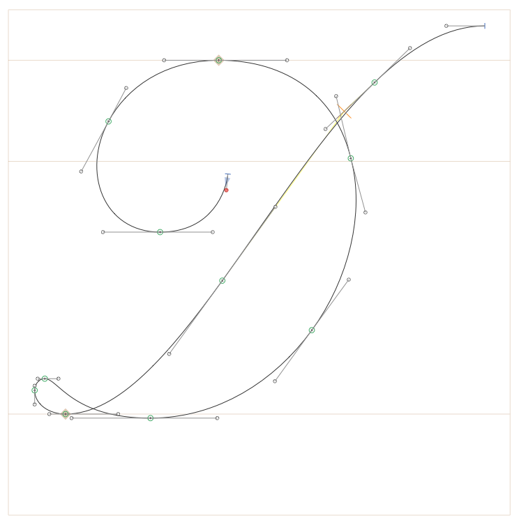
And considering the natural movement of the hand, I think that the “end pressure point” when using a real pointed nib would be positioned before that bend in your example. But, of course, people have different ideas how things should look, and I understand that cases like the one you described would be common.
OK, understand your position. I’m done pushing for this feature, you win!