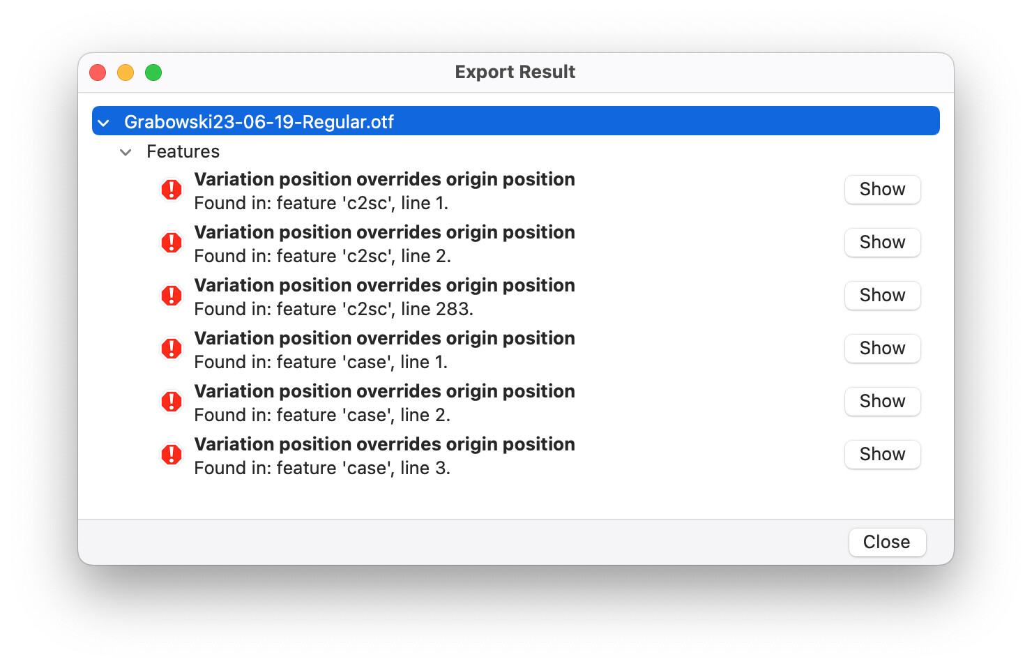
Hi, I tried following this tutorial with my variable font:
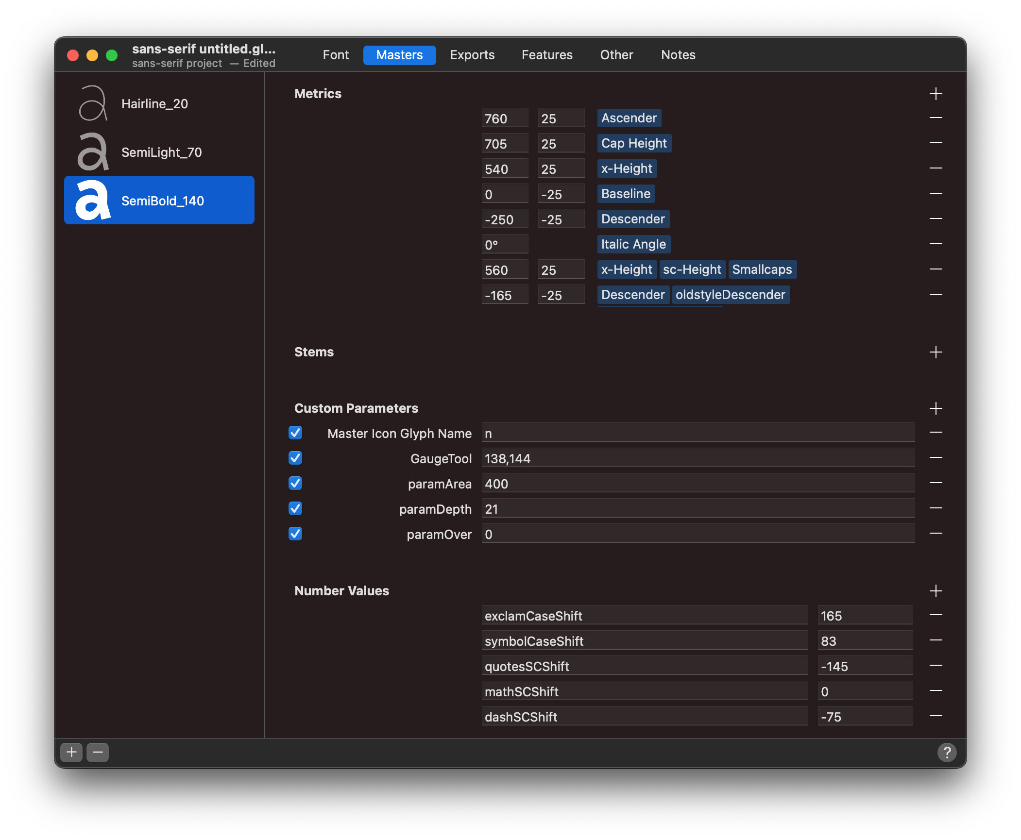
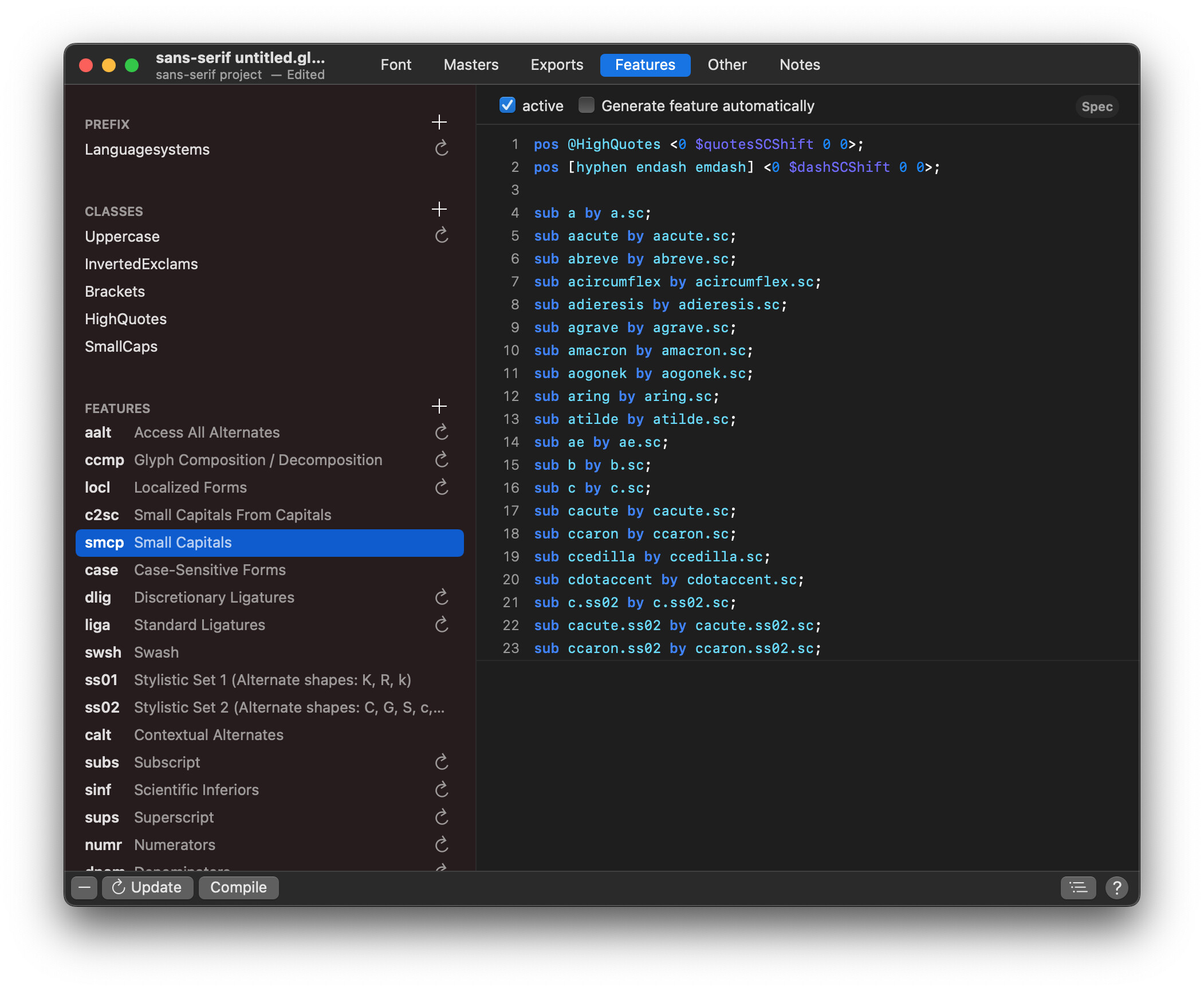
I wanted to make some case-sensitive (and smallcaps-sensitive) forms for parenthesis, quotes, dashes, some symbols, inverted question and exclamation marks using opentype pos function inside case, smcp and c2sc, but it doesn’t work exactly as it should. In the thinnest master it looks okay, but as the weight increases, the forms shift too much. I am pretty sure I calculated everything, but here are my number values and metrics:
$exclamCaseShift — distance between x-Height and Cap Height used to shift exclamdown and questiondown upwards to match the uppercase (= Cap Height - x-Height)
$symbolCaseShift — distance between the centre of lowercase characters and the centre of uppercase characters used to shift parenthesis and some symbols ex. arrows upwards to match the uppercase (= Cap Height / 2 - x-Height / 2)
$quotesCSShift — distance between the Cap Height and Small Caps Height used to shift the upper quotes downwards to match the small caps (= Small Caps Height - Cap Height)
$dashCSShift — distance between the centre of small caps and the centre of uppercase characters used to shift dashes downwards to match the small caps (= Small Caps Height / 2 - Cap Height / 2)
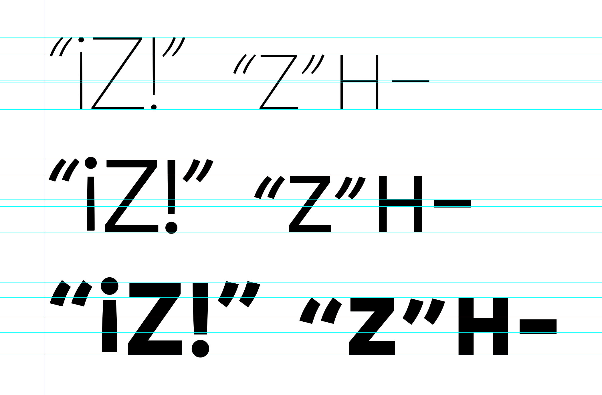
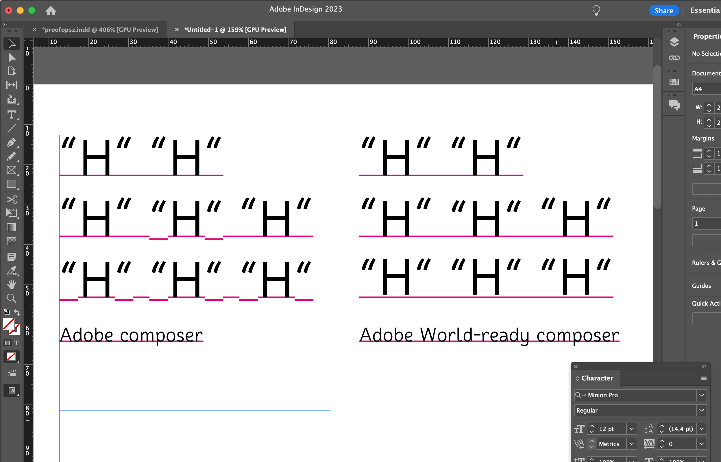
Below is a screenshot from InDesign showing how the quotes, dashes and inverted exclamation marks miss their desired positions in bolder masters. The problem seems to be gradually more significant, interpolating along weight, so it looks like the unit by which the pos function performs is different than the one of the font, idk… What do you think? Has anybody had this kind of problem before me? I haven’t seen similar topics on the forum. I mean I could always do a workaround by making the substitution. Thanks
Ah okay! So I understand that for the variable font I must create alternate .case versions for cease sensitive forms? Or maybe the feature will come in some not so distant update?
Hello @mekkablue I’ve been trying to use this variable positioning within ot code and had strange effects. The values don’t interpolate and other glyphs are shifted. I noticed that the shift is calculated by the first set of values.
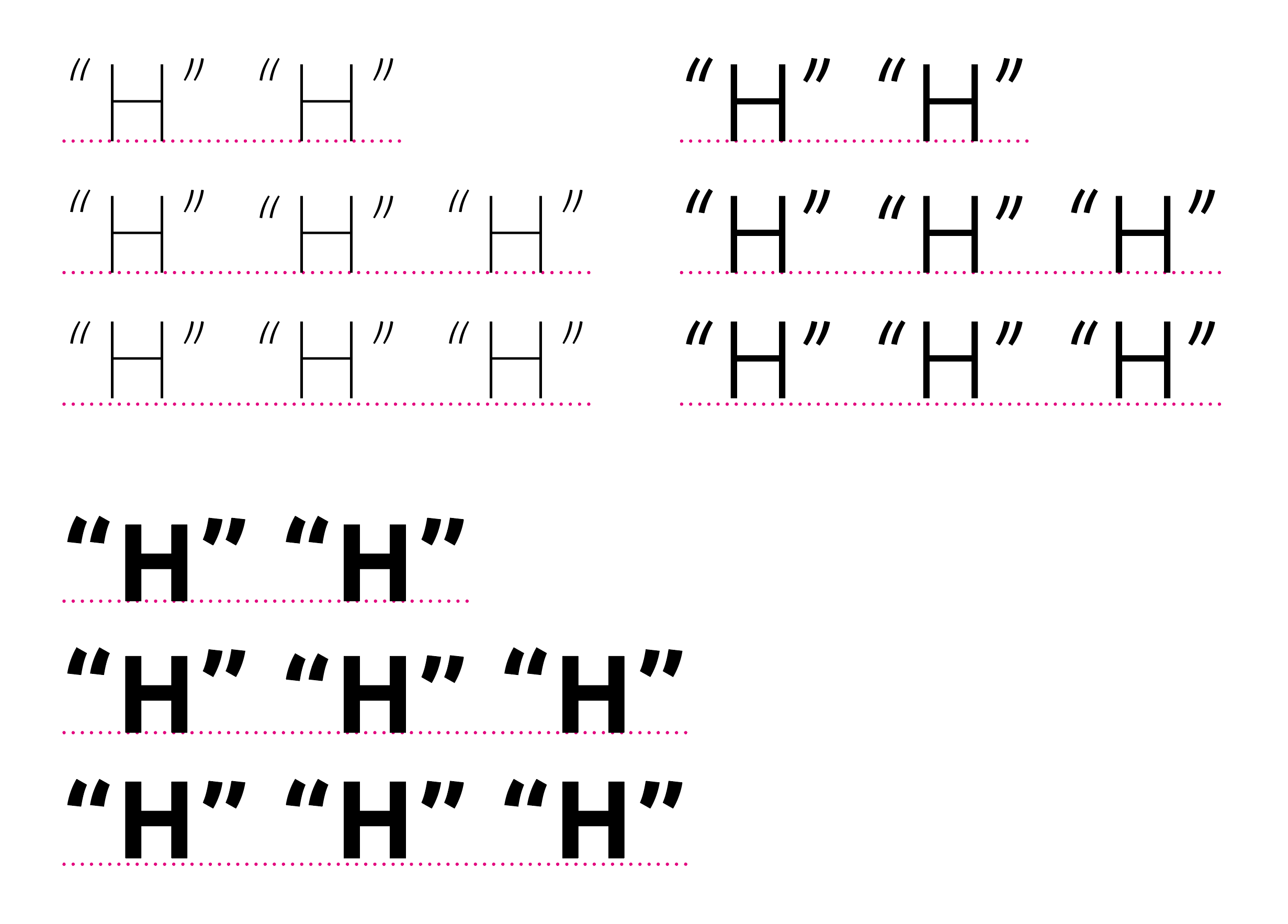
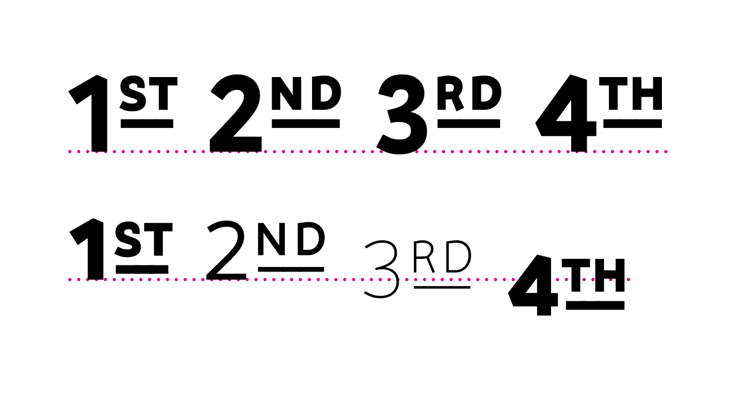
Here are the results in InDesign in three weights: first line is with case turned off; second line has it on only on the middle “H” and it seems to work fine only in this case; third line has this turned on everywhere and in this case instead of lowering the quotes, InDesign lifts the Hs up. I added the dotted underline on the baseline so that you can see better.
Another example of a different feature (smcp+c2sc) shows that the values don’t interpolate (in previous example the value is the same throughout all weights). The regular and bold ordinals went too low:
I put the #ifdef VARIABLE and #ifend around the pos code and then added the pos code in the export of a static font as a custom parameter ‘replace feature’. Now the static font exports normally, yet it still repositions text in a weird way.
@mekkablue, yes, the problem seems to occur only in World-ready composers. But then some contextual substitutions don’t work in traditional adobe composers.
I don’t really know, to be honest, I think somebody told me to do so long time ago and I never questioned it, but it seems to make no difference with or without the '
also the pos thing seems to affect text that is typed after so I wanted to double make sure that the pos rule applies only to the glyphs I want it to but it doesn’t make any difference
But the contextual pos rule might be handled differently by the different composers. The simple single pos rule should be much better supported.
If you need the underline to work properly in Indesign, you can’t use GPOS but you need to add alternate glyphs that are shifted down and replace them with GSUB.
@GeorgSeifert no no, I’m not worried about the underline. I added it only to show where the baseline is. It is only to show that in world-ready composers some glyphs are lifted above the baseline or under the baseline although they were not told to by any pos rule and those that should have been shifted down, stay where they were. Like in the screenshot several messages up with “1ST 2ND 3RD 4TH” where they go crazy when I use different weights.