I guess the potential issue with the latter approach is that GlyphsApp will expect roman and italic to be interpolatable. That is not necessary a problem; the Custom axes can be for italic.
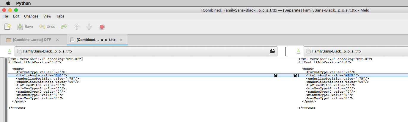
However, the export results are different in ways I don’t expect:
At an early design stage, some users prefer keeping roman and italic in the same file. I would not necessarily use a second axis for this though. The problem is not interpolation or non-interpolation (for that, just make sure your instances are placed right), but differences in glyph and feature sets, and other differences you may want to sort out on a font level.
So at some point, it simply makes more sense to split and continue in separate files. Apple’s new split view comes in handy in that case, btw.
In many graphics editors its possible to create a ‘duplicate’ window of the same file at the same time, so that you can do this kind of thing on a single file. I doubt it is part of the Apple HIG though.
I wish Glyphs will eventually allow me to work on Roman and Italic in one file as part of a standard Glyphs workflow. It would make all family-related settings easier. Now I have to do many tasks twice.
In Proxima Nova, I have an alternate lowercase a in both the roman and italic. The alternate for the roman goes from two-story a to one-story a, but the alternate for italic is the opposite. Part of the reason for the alternate is to allow both the roman and italic to share the same form, either two-story or one-story. Therefore, I have one stylistic set only for the roman that changes to the one-story form, and another stylistic set for the italic that changes to the two-story form. If I used a single feature for both, the form would change in both roman and italic, which would mean that you would get a two-story form if you changed to italic from a one-story form in roman, which would be weird.
Technically, I could have the same feature code for both roman and italic using two stylistic sets as I do now, but get the behavior I want by adding extra copies of the two-story form to the roman (for the single-story to two-story set), and extra copies of the one-story form to the italic (for the two-story to single-story set). This would add 24 extra glyphs.
That said, it would be nice to be able to have both roman and italic in one Glyphs file. Differences like this seem to be the main reason not to.
I spoke to Georg about this recently and he basically said that stuff like testing full OT features, or looking at Roman and Italic next to each other, are better done by exporting regularly and looking in a real document system (web/DTP app) with full OT processing.
Wondering if it could be applied as one file in my specific case:
A font I’m working on its Italic weights; has 14 glyphs with totally different design; and 8 different ligatures; but all the rest glyphs are simply slanted!
Could the Italics be resolved by the original file or must be produced with a 2nd file?
Or you simply don’t put any instances between the upright and italic masters. Add an italic axis (ital), set it to 0 for the uprights and 1 for the italics. Do not enforce compatibility check, do not put any instances at ital=0.5 or something.