MyFonts gives me this error:
We’ve tested your fonts to ensure that when used on Windows, the acsenders and descenders will not appear clipped or cut off. It is good practice to ensure that your vertical metrics also accomodate your diacritics.
These are my settings for all masters:
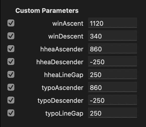
typoAscender = 780
typoDescender = “-220”
typoLineGap = 200
winAscent = 980
winDescent = 290
hheaAscender = 780
hheaDescender = “-220”
strikeoutPosition = 324
strikeoutSize = 50
Highest and lowest glyphs for Supernett:
Master: Light
Highest: (top y: 934.1)
Lowest: (bottom y: -242.0)
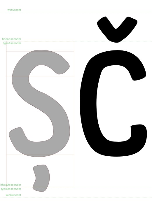
The typoAscender seems low, but it is hard to say because you did not tell us how high your (cap) diacritics are, which is what the MyFonts error message is about:
Try the Webfont Strategy from this tutorial please:
MyFonts is talking about Windows, so I guess they mean winAscent and winDescent.
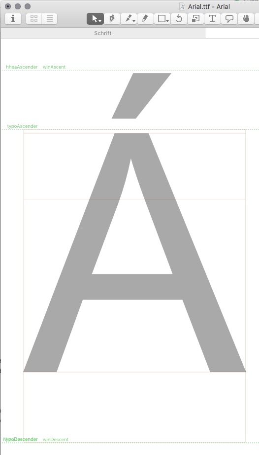
As this is an update for an existing font, I favour to keep Vertical metrics as much as possible. I hope, the screenshot helps.
Yes, but it is too low. Please read the tutorial. I pasted the summary here:
winAscent = vertical maximum round this value up
winDescent = vertical minimum (positive value) round this value up
typoAscender = hheaAscender = include important uppercase diacritics (e.g. É, Å, Ñ, Ő, etc., or the letters reaching high above the baseline you care most about) round this value
typoDescender = hheaDescender = include descenders completely (the lowest point in j, g, p, q, y, or the letters reaching below the baseline you care most about) round this value down
typoLineGap = hheaLineGap = sensible padding between lines: approx 10–20% of the sum of typoAscender and typoDescender , consider more if descenders and ascenders touch each other across lines (in browsers and Office software), less if your ascender and descender values are pretty large
Font Info > Font > Custom Parameters:Use Typo Metrics = yes
The Webfont Strategy produces quite a distance text to textbox in layout apps which I do not prefer.
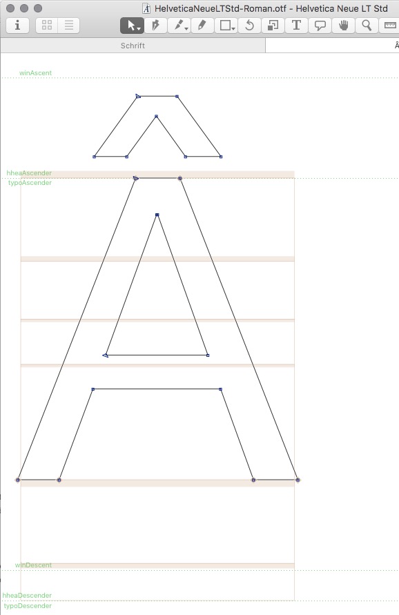
It more or less results in winAscent = typoAscender = hheaAscender
I don’t recommend ascenders so low, and hhea/typo values different because that creates discrepancies between browser renderings. The win values are just for clipping, and the hhea/typo Ascenders should give the ‘Ascent’, not the cap height. For the cap height, the Adobe apps (and probably also XPress) already have a different first baseline offset setting (Cmd-B in InDesign). What you are trying to do is to make the Ascent match the cap height, which is literally wrong (ascent and cap height are two different things), and thus results in a confusing UI and takes a choice from the user (because both settings give the same baseline offset).
The original family was created in 2013 with Vertical Metrics settings as above.
The 2019 rework and addition may be combined with the 2013 fonts and customers may expect a similar behaviour. This is why I decided to keep typoAscender and typoDesender unchanged.
Your tuturial for Vertical Metrics is great. Here you describe as follows, which let me guess that hheaAscender corresponds with the caps height:
hheaAscender: the height of the ascenders in units
typoAscender: the height of the ascenders in units
winAscent: the top extremum of the font rendering box
What about generating Web Fonts with different settings:
winAscent = typoAscender = hheaAscender
and the same with all Descenders
I do not recommend to equate all values, I recommend the Webfont strategy as outlined in the tutorial. Everything I know about the subject is in the tutorial, but feel free to draw your own conclusions.
Am I missing something?
If the diacritics are the tallest and lowest and it is recommended to consider their heights when we set the hhea,typo and win. Won’t they be equal like always?
The only way around this would be to make hhea and typo height to go below the diacritics. But this is no option really? Or is it?
If you set them all to the tallest heights, the distance between lines will likely be too high, unless you have a design with very compact diacritics. I discussed this at length in the tutorial.
I’m having a similar issue. When submitting my fonts to the Monotype/MyFonts validator, I get a yellow checkbox about the Windows vertical clipping, and another complaining that the “ascend” field isn’t consistent…even though it is.
I’ve followed the webfont method tutorial, and I’ve read the Monotype article on clipping. I’ve tried a dozen things and nothing will pass the validator.
The following settings have worked well in my own testing, and they behave well on Mac and Windows, even Office, but will not pass Monotype’s validator:
If I remove the hhea/typo fields and submit with just the win values, it passes, but then the spacing looks odd in some apps like Figma and Office, of course.
Any assistance would be most welcome. I’ve spent so much time trying to figure this out that I’ve considered pulling my work off of Monotype altogether.
What is also necessary with this setup (typo=hhea) is to set the Use Typo Metrics parameter. Otherwise win=hhea is assumed. If it still does not pass, it is better to contact the MyFonts support.