Hi I’m having an issue online with my WOFFs that I can’t get my head around. I’m trying to center type vertically in a frame, but it appears slightly too far down. When I select the text in the browser I can see there’s a lot of space in the highlight above the text, when compared to Arial for example, (two screen grabs attached, the one that’s not Arial is my font). The space above seems to be what is forcing my font to look further down than centered.
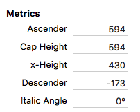
I have attached an image of my ascender descender height and the type in glyphs.
Does anyone know the reason why there’s so much dead height above my glyphs?
Hi George thanks for responding. Yes I’ve read through it a few times. My take away is that because this font has a low x-height (430) then I should maybe use the Adobe Strategy, and “Whoa” at the end. Or is it the Webfont Strategy?
Also, I can’t see from the tutorial where in glyphs do you set the custom parameter?
Does it affect the positioning in all apps or just online?
Thanks
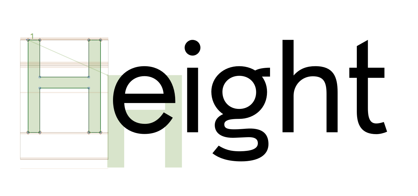
Thanks mekkablue. I’ve been through all the glyphs and the tallest are the { ∫ and the upper case characters with diacritics. The tallest part of the font is acutecomb.case which is a little over 200 higher than the ascender height. I’ve attached an image of those characters highlighted in a browser window. The space above the top of the acute is still more than the space below the baseline. Would accents affect this issue?
Thanks
I’d suggest using mekkablue’s “Report Highest and Lowest Glyphs” script to test this, since the problem could be a stray point, which would be easy to miss in surveying the font.
Your ascenders are quite small. That results in a rather big default line spacing. You could try to reduce the UPM or set the typo-metrics as described in the tutorial.
That’s a great tip thanks psb6m.
I ran the script and the results are:
Master: Regular
Highest: Aring (top y: 811.0)
Lowest: Gcommaaccent (bottom y: -290.0)
So the highest point is 229 higher than the ascender height, and the lowest point is 117 below the descender line, so there is a bit of top bottom in balance but both of those cases are with accents, shouldn’t it verticals be determined by the ascender / descender?
George yes the ascenders are low to allow for pacing lines of type tighter. Given the x-height is only 430 when standard is 500 for a UPM of 1000, would you recommend reducing the UPM to double the x-height 860? (the font does appear much smaller than other fonts at the same point size). Would changing the UPM retrospectively after the font is completed have any adverse effect on exporting or using the font as a WOFF or OTF?
George, regarding the typo metrics, I’m struggling a bit with that article.
Does one have to use all of those examples to optimise for all OS platforms? I don’t want any accents cut off on any platform…(" Disadvantages: differences between Mac and Win display; accents on caps may be cut off in office apps."
Or just use the parameter for example webfont as “This is a good compromise between the two other strategies. The differences in vertical placement are not zero, but reasonably minimised between apps, operating systems, and especially browsers.”
I assume those values then get entered into the Custom Parameter box of both masters?
In which case, I believe my parameters would look like this: (calculations for ascender 594 descender -173 with UPM still at 1000)
Hi George! Thanks so much for looking at this very much appreciated.
I tried the first set of parameters you included and they seem to have worked perfectly, the text is centered!
Did I do something wrong with the calculations? How did you get to those numbers? I thought the winAscent was the same as the ascender height? Have you used the highest and lowest airing of Bold?
winAscent : the top extremum of the font rendering box
winDescent : the bottom extremum of the font rendering box (positive value)
but ‘font rendering box’ is a bit misleading. I’d also checked with two random fonts, one being Arial, where the winAscent is the same number as the ascender height which threw me off.
George, in this instance for the for the hheaAscender you haven’t used the: UPM × winAscent ÷ ( winAscent + winDescent ) round this value
formula given in the tutorial for webfont, which would give 739.
Is it better to just use the highest extremum? Certainly simpler and seems to have worked.
This formula is just an aid. In your case the drawing are a bit small on the UPM and that produces the big line spacing. change the formula to give you the UPM and use that as the UPM. But that will change the size of the letters in the browser.
Thanks George.
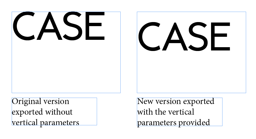
With the parameters you provided I have exported WOFFs that are centering perfectly vertically in a text frame online.
However, now when I export with those parameters as OTFs and use them in InDesign, and center text in a frame vertically, the type shifts slightly downward, where before without the vertical parameters it was perfectly centered. It’s easier seen if I draw a text box and type with the old version (pre vertical parameters) upper case type is jammed right up to the top edge of the text box. The newer version with the vertical parameters shifts down so there’s a gap between the top of the caps and the top of the text frame (I should have put an accent on one of the characters in the screenshot as now the top of the accents align with the top of the text frame where before it was the top of the caps) .
Do you know why that is? Is there a way to get them to work online and desktop? Thanks.
I think on this point you should at least a bit understand what the diferent metrics are doing. So you can play around. Change one of them by 100 units and see what happens. The. Repeat that until it works as you need in all environments.
And read the tutorial again and again. It has all the info you need.
And sometimes there is no ideal solution. Because what each app does with the information you put in the font is a completely different story. And it also comes down to what you want. You said ‘center’, but center what? The x-height, the caps?
Hi guys, thanks for your patience and all of your help with this. I’ve worked through and come to a solution I am happy with, rendering as I want online and in InDesign. (Hopefully not messing anything up in any other apps). It was the typoAscend set to the top extremum that was shifting the vertical position of my OTFs down in InDesign so that’s now set to the cap height where winAscent and hheaAscent are both set to the extremums.
As a summary of where I have got to, if anyone gets to the bottom of this thread:
Hi George, yes I have some text blocks set in the browser. I have had to adjust the line height in some cases but nothing drastic. When I was experimenting with the parameters I didn’t notice what effect typoLineGap was having in the broswer, or in InDesign.
Is it just a case of seeing what works (“recommended” space between lines), as long as it doesn’t go over 1/5th the UPM? I know there’s the formula in the tutorial but that seems to suit fonts with large x-height, and on some tests I have done on paper the formula has given a typoLineGap way above 200.
I noticed on the example parameters you recommended a few post back in this thread you set the typoLineGap as 0 (zero) so figured I’d remove it. Is that a bad idea? Does it result in tightly packed lines on some OS ?
Hi, I tested the typoLineHeight with a few values and exported as WOFFs, viewed in a browser (Chrome on a Mac) and as OTFs tested in InDesign also on a Mac. I didn’t see any change in either of those when compared to the same font with no typoLineHeight parameter, and the only place I saw a difference in line spacing was in Text Edit.
Is it more officey programs or PCs that are affected? I have no one of testing those, in which case is it better to add some typoLineHeight just to be safe?