Salam and Hi,
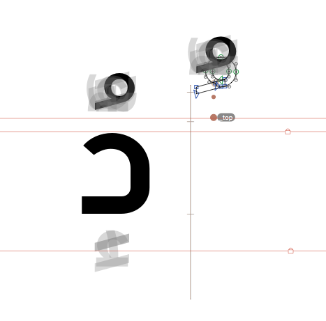
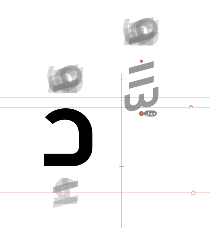
While single marks (like Damma-ar) are previewed on letters when the anchors are selected
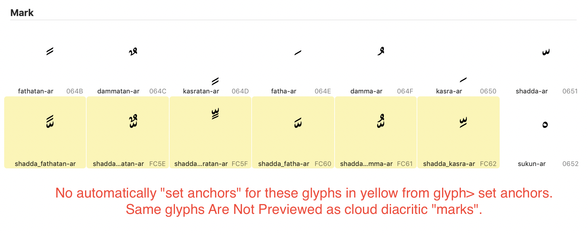
Combined marks (like shaddaFathatan-ar) are not previewed on letters when anchors are selected, therefor they are very hard to position. Why aren’t they showing in the preview? Or am i doing something wrong?
In my exported font these combined marks are always not where i want them to be and i can’t figure how to position them without seeing a preview of their placement
I managed to do it finally, but still wondering why they don’t show above the letters when anchors are selected, i need to judge where they fall compared to the ascender line, some text engines crop what appears above the ascender line.
They should be in the mark cloud. If a mark is missing in the cloud, please give us a list, and we can add it to the glyph data. Or you can do it yourself with EditGlyphData (see glyphsapp.com/tools), and publish it here or on a site like GitHub.
Do you need a different distance of the shadda and the shaddaFathatan to the base glyph? If so, you simply don’t add anchors to the latter. I’ll see if I can add them to the anchor cloud.
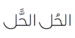
Regardless to design testing; positioning of diacritics should adhere to syntax rules;
Hence all “Tanween” cannot be positioned over/ under medial & Initial forms;
The combined “shadda” with Tanween can appear only over Final forms.
I can affirm it for Arabic language at least… missing the knowledge concerning other languages based on Arabic script.
One more note about a common mistake which many do not pay attention to;
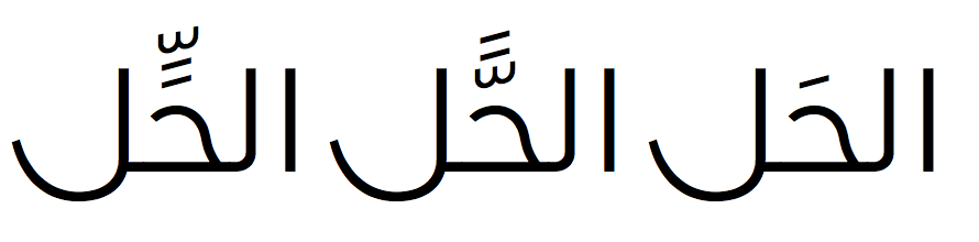
A shadda followd by Fathatan should usually split; where the .fina .isol case get the shadda > then alef bearing Fathatan (Tanween) comes after.
No I meant, are there other cases besides shadda+fathatan (and the optional split of shadda+kasratan), where one part goes above the alef, the other stays where it is?
The other optional case I knoww is shaddaKasra-ar where Shadda may be positioned above a letter; while Kasra be detached and positioned at its normal place under the letter.
Avantino, I don’t think your suggestion is accurate. What you considered as “right positioning” is actually a common mistake which started on to appear only in typography. You would find contradicting ideas about this matter but if you go back to calligraphy and manuscripts it will be obvious that “tanween” should always remain with “shadda” even if there is an “Alif” following.
I never heard of this behaviour (but that doesn’t mean it might not be true). I hope some other people familiar with this can comment.
Until then, you can do the Opentype feature yourself. You need to reorder the Fathatan and the Alef with some tricky OpenType feature code. I’ll see if I can find example code and post it here.
actually I have play with it and it works for issue no.1
the anchors has benn added automatically
but still issue 2 & 3
● No preview of these marks as cloud marks
● No preview of other marks above them when their anchor is selected!