You need the latest cutting edge version. Activate it in Preferences > Updates.
Thanks, Georg!
I worked on the performance issues in Mojave a bit. It works for me now. Could you please try this version: dropbox.com/s/fz6f0nz3vlti560/Glyphs2.5.2-1180.zip
I’ve noticed in the latest update that the zoom performance is slightly slower than in the previous version. Apart from this everything is working well in the dark mode.
Hi! The Fix Compatibility screen looks like this on Mojave Dark. Is this intentional? Running Glyphs 2.5.2
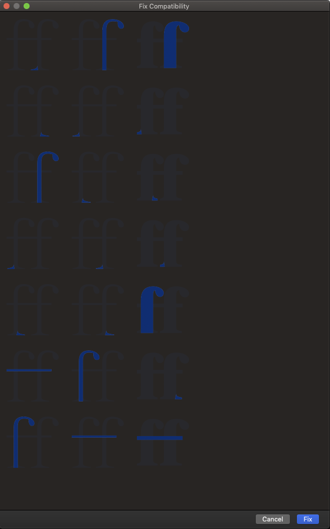
It is not intentional. I’ll fix it.
1 Like
The TextView in Preferences > Sample Strings could get a make up as well. Probably reversed out text.
I fixed the sample strings already.
1 Like
You’re updates come faster than one is able to report things ![]()
![]()
2 Likes
Dark mode is looking OK, but it would be really good to make it optional via a check box in Preferences. I’ve seen other apps do it that way with good effect.
The main edit area is still black on white. If someone decides to have the system in dark mode, he/she should be OK with dark pallets and toolbar? Why would one have it differently?
Because white on black small type is hard to read for one thing.
But that is true for the rest of the system. So why activate dark mode in the first place?
I am working happily in dark mode in the OS and most apps - I really like it. The pallets and toolbar in Glyphs are fine for me, and I’m really glad the main edit window is still ‘normal’.
However I’m finding that the main font window that shows all the glyphs is giving me a lot of trouble. I find it much more difficult to identify glyphs when they’re white on black, and I don’t easily see slight differences. For example, I’m working now on the bold version of a font, and I want to look through the glyph inventory to see if there are any glyphs that I haven’t bolded yet. If I have dark mode on I find it harder to see them. If I turn dark mode off they jump right out at me.
There are scientific issues that contribute to this when you have relatively large white letters on a very dark background. Halation can increase the perceived white area and interfere with stroke weights, level of contrast, etc.
It can also be argued from a macOS point of view that the font window is also a ‘document’, or else that it’s a gallery of images like in Photos. In that case the glyph image (black on white) is the ‘photo’ which should not be reversed, even if the captions (name, unicode) are in full dark mode.
So I’d prefer to have the ‘images’ in the main font window back to while on black, or if we can’t have that, have a preference to turn off dark mode altogether.
1 Like
Thanks for the explanation. That is much more specific and I see your point. I’ll have a look.
1 Like
I couldn’t find an option to disable dark mode, is it hidden somewhere, or do I need to run the macro above? My poor brain can’t process white on black glyphs in the main window (black on grey might be better for dark mode?) and for glyphs that are marked with a colour, I can’t tell which colour is which. The sidebars are fine in dark mode, for me.
1 Like
You mean to control the dark mode in the font view?
Glyphs.defaults["GSFontViewDarkMode"] = False
(run that in the macro window)
1 Like
Or use Hidden App Preferences in the mekkablue scripts.
1 Like
Thank you, I hadn’t seen that plugin ![]()
I totally agree!