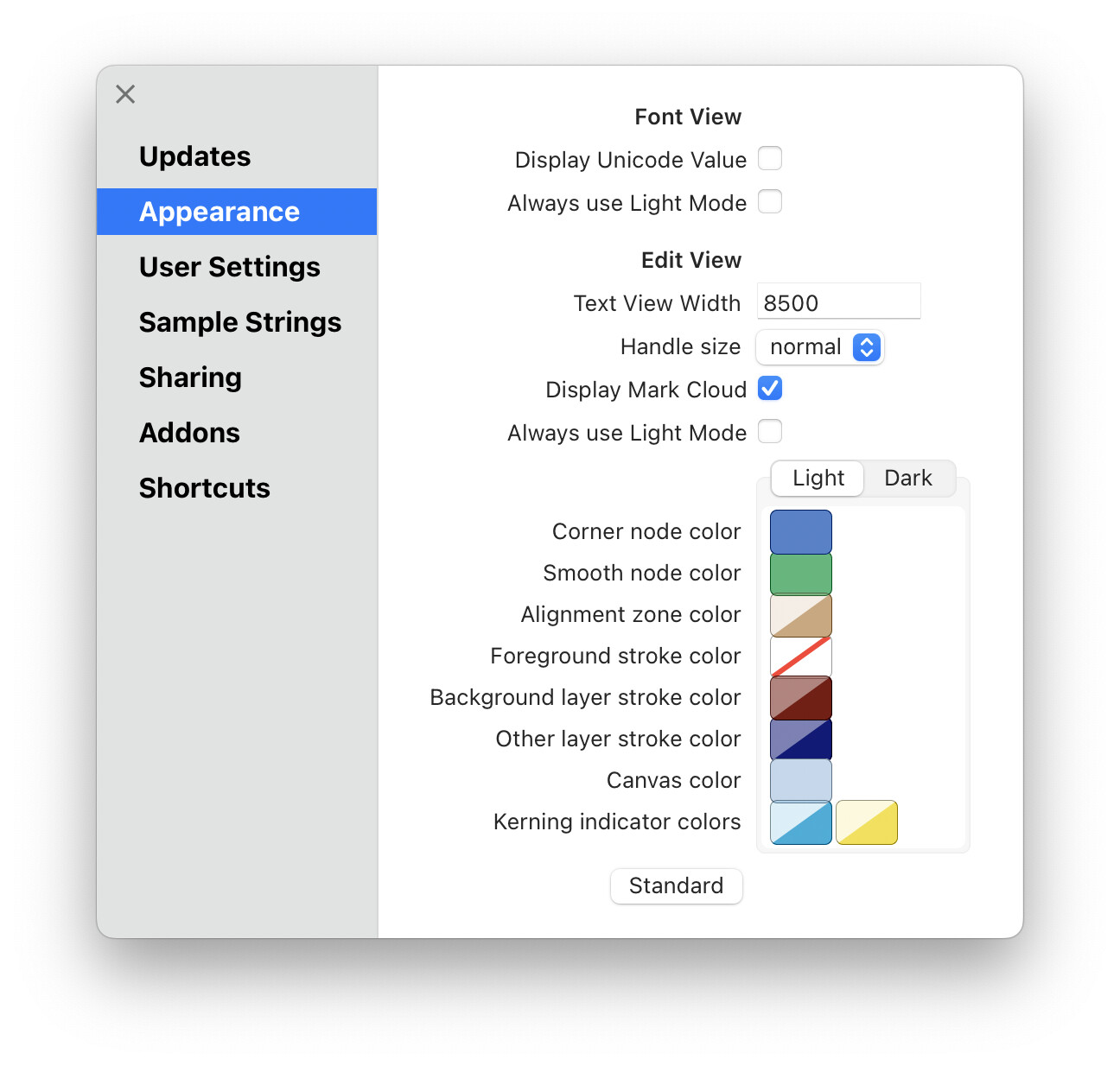
Did it used to be possible to change the canvas colour - including foreground and background layer’s canvas colour? I went to look for the option and it’s gone now.
I need it because when I’m working past sunset I have flux/‘night shift’ on which makes everything redder and at that point the foreground and background layer’s canvas colors are too similar.
I don’t seem to be able to set the canvas colours. Right now both foreground and background canvas colour is white, which is very confusing. I’m on the latest version of Glyphs on a Macbook Air m2 using Monterey.
Looks OK. Did you change the canvas color before taking the screenshot? And could you also post screenshots from the color picker for when the canvas color is being edited and the main Glyphs window when the canvas color changed.
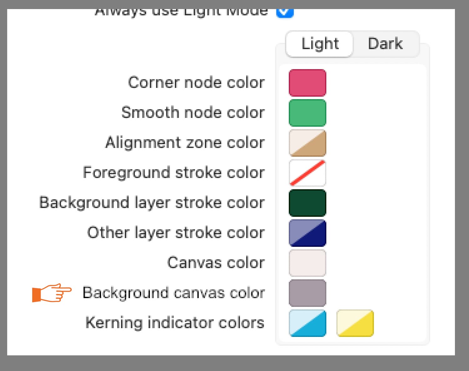
Hi Florian, If I set the canvas colour this way, both foreground and background have the same colour. I want the foreground to be white and the background something different, so that I have a visual clue to where I am editing.
The foreground is still black in your screenshot, not orange. If you want, you can change the foreground color separately with the Foreground stroke color setting in the Appearance preferences. Or maybe we are talking about different things? Could you draw a quick mockup of what you want your Edit View to look like.
I have the same request. When night shift is active, foreground and background colours become really hard to tell apart. It would just need another line in preferences so we can make it darker
yeah but like you say, without an interface we need to find some other way to get the hex values, not very user friendly. And in my experience, using macros to change stuff doesn’t stick when updating Glyphs. (at least that macro that shows overlapping paths in G3 like in G2 hasn’t stuck after updates, and i can’t find the thread where somebody had written it) Why not just add such things in the UI?
In general, defaults set via the Macro Panel stick around. But, they are not as future-proof as options that have progressed to get their own UI. This is how new options are often introduced: As a hidden user default first so that people can try and if it proofs to be generally useful, it should get a UI sooner or later. The same applies to the background layer color.
That would be the following:
It’s set per font, not globally for the app. That might be why you are not seeing its effects on new font files.