First of all: Thank you for the wonderful Glyphs 3!
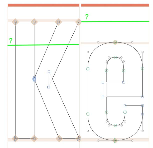
But … I have one question: Is it possible to show the x-height metric line when working on capital letters and the cap-height metric line when working on lowercase letters. The way it was in Glyphs 2? !
I’m really struggling with this. I have applied the filters but only one will work at a time. So if I try show x-Height to letter, punctuation and numbers, it shows nothing on any.
Having x-Height and Cap Height on all glyphs is super useful, but i cant see any way to show them?
The solution suggested by Florian above violates the Don’t Repeat Yourself rule so it is unacceptable to me. Redundancy is a no-go, it’s the root of many avoidable problems, and I don’t accept being forced into this. Just imagine the horror of finding out you have been working with the wrong metric for many hours, just because you forgot to update both values when you changed it. And then you have to update everything again.
Is there really no other solution? Something like a simple user setting that says, “Show all metrics everywhere”.
Why are you assuming users don’t want to see the x-height when working on the capitals? And, even more confusing, why are you assuming the users do want to see the ascender when working on the capitals? What is the reasoning, and why are you forcing it on the user?
Also, the most natural solution, to add a filter to the general metrics (without a duplicate), as recommended by Rainer above, seems to be rather dangerous.
My feeling is that some users will have that same idea and then encounter severe problems (of various, unexpected sorts) later, possibly without any clues what the underlying problem is.
Any update on this? I can’t imagine ever not wanting to see the descender, baseline, x-height and ascender in every glyph, and I agree with Tim that having to set up a ‘fake’ extra doublet-metric to achieve this is not ideal.
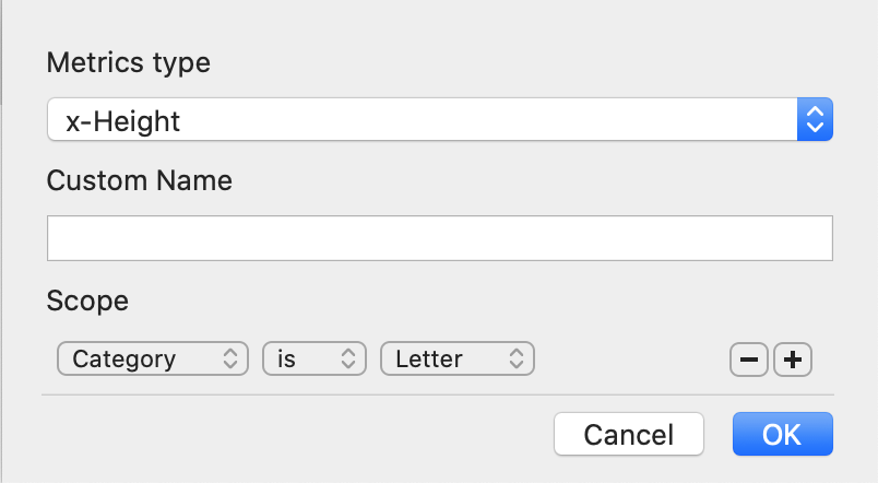
The easiest option, I imagine, would be to add an “Any” option to the Category filter.
Edit: Gah, misread the date on Georg’s post as being from July 2016, rather than the 16th of July. Not five years with no update, only a couple of months.
I’ve gone back and forth with this one since I started using Glyphs 3. There are times when having all of the zones is great, and there are times when I want the filters on. Maybe “View > Filter Metrics Zones” to turn filtering on and off would solve this.
For one, it confuses me, to have different lay-outs for different glyphs. Second, I feel comfortable having those landmarks when navigating the drawing space.
I don’t understand what is dangerous about adding the scope. It’s not forcing if you have a choice, and you do have the choice. By default we show the least possible clutter. And while you may prefer to see it, you do not need the x-height for designing caps.
Personally I was skeptical at first too, but have gotten used to it quite quickly, and I now find it much better to have a lowercase letter typed out next to the cap than to have the line go across the cap.
Ascenders and descenders are not for lowercase only, there are many more purposes, beyond Latin even. That is why we always display them. But x-height? If the x-height is relevant for your cap design, no problem, switch on the scope. But for most designs of most users, I do not see why it should be the default.